lime-build
by Vikrant Rathour
Vikrant RathourBuild Sprint 1 of a new SaaS product called Portal Builder. PRODUCT IDEA The product lets users visually design and plan a complete web portal/application using a sticky-note canvas. Each sticky note represents a screen/page/feature. Users arrange notes on a canvas and connect them to represent navigation and user flows. The long-term vision is: Visual portal planning → user flows → actual portal generation This sprint is FRONTEND ONLY. Do not build backend, authentication, database, APIs, payments, AI, or real persistence yet. Use mock/local React state. ⸻ SPRINT 1 GOAL Build a polished frontend experience covering: Dashboard → Create Project → Visual Workspace The result should already feel like a real premium SaaS product, not a prototype/template. First inspect the existing Replit project and reuse the existing frontend setup where practical. Prefer React + TypeScript + Tailwind if already available. Avoid unnecessary dependencies. ⸻ DESIGN Create an original premium SaaS design inspired by the usability of Linear, Notion, Figma, Miro and FigJam, without copying them. Style: * Modern * Minimal * Professional * Spacious * Fast-feeling * Slightly playful because of sticky notes * Excellent typography and spacing Avoid generic Bootstrap UI, excessive gradients, excessive glassmorphism, and overly rounded/colorful cards. ⸻ 1. APPLICATION SHELL Create: * Collapsible left sidebar * Top navigation/header * Main content area Sidebar: * Product logo/name * Dashboard * Projects * Templates * Recent * Settings Bottom: * User profile/account menu Responsive behavior: * Sidebar becomes mobile navigation on smaller screens. * Workspace remains a usable visual canvas on tablet/mobile. ⸻ 2. DASHBOARD Create a polished dashboard. Header: Good morning, User “Build and visualize your next portal.” Primary button: + New Project Add a Recent Projects section with realistic mock projects: * Employee Payroll Portal * Client Management Portal * Healthcare Admin Portal * E-commerce Operations Portal Each project card should show: * Name * Description * Last edited * Number of screens * Number of flows * Small visual preview of sticky notes Add Quick Start cards: * Start from scratch * Use a template * Import existing flow These can remain mocked/non-functional except for Start from Scratch. ⸻ 3. CREATE PROJECT Clicking + New Project opens a polished modal. Fields: * Project Name * Description Example: Employee Payroll Portal “Portal for managing employees, payroll, tax forms and reports.” Buttons: Cancel Create Project Creating a project should use local state and immediately open its workspace. ⸻ 4. VISUAL WORKSPACE This is the HERO feature of Sprint 1. The workspace should feel like a visual whiteboard/design tool rather than a webpage containing cards. Layout: Top toolbar + Large canvas + Optional right inspector Canvas requirements: * Large/infinite-feeling workspace * Dot/grid background * Pan * Zoom in/out * Zoom percentage * Fit-to-screen * Select objects * Drag sticky notes * Clear selection state * Smooth interaction Top workspace bar: Left: * Back to Projects * Project name Right: * Undo * Redo * Share * Preview * Settings Buttons that require future functionality may be disabled/placeholder, but should look complete. ⸻ 5. STICKY NOTES When a project opens, populate it with a realistic sample flow: LOGIN “User authentication” DASHBOARD “Main overview” EMPLOYEES “Employee management” EMPLOYEE DETAILS “Employee profile and payroll information” PAYROLL “Payroll processing” PAYROLL RESULT “Payroll results” REPORTS “Reports and exports” Create branching relationships such as: DASHBOARD ├── EMPLOYEES ├── PAYROLL └── REPORTS Sticky notes should have: * Screen name * Short description * Type/category * Optional icon Types: * Page * Form * Dashboard * List * Detail * Modal * External * Decision Use subtle visual differences between types. ⸻ 6. STICKY NOTE INTERACTIONS Implement real local frontend functionality. Users can: * Select note * Drag note * Edit note * Duplicate note * Delete note * Create new note Double-click or edit action should allow editing. Add a prominent + Add action in the canvas toolbar. Options: * New Screen * New Form * New Dashboard * New List * New Detail * New Decision Creating a note should immediately place it on the canvas and make it draggable. ⸻ 7. CONNECTIONS Implement basic visual connections between notes. Connections should show: Screen A → Screen B Use clean directional lines/arrows. If full interactive connection editing is too large for this sprint, at minimum implement the connection architecture and display connections between the sample nodes. Do not make connections visually dominant. This feature will be expanded in Sprint 3. ⸻ 8. RIGHT INSPECTOR Selecting a sticky note opens a right-side inspector. Example: SCREEN Name [ Employee Details ] Description [ Employee information… ] Type [ Detail ▼ ] Status [ Draft ▼ ] Actions: Duplicate Delete Changes should update local state immediately. Inspector should look like a professional design-tool property panel. On mobile, convert it to a drawer/bottom sheet. ⸻ 9. CANVAS TOOLBAR Create a professional toolbar containing: * Select * Pan * Add * Connect * Zoom Out * Zoom % * Zoom In * Fit At minimum these should work: * Select * Pan * Add * Zoom * Fit Use tooltips for unfamiliar icons. ⸻ 10. MOCK DATA Provide at least 3 realistic projects so the dashboard never feels empty. Primary sample project should have a meaningful flow with branching navigation. All data can live in local React state/mock files. Structure the code so local state can later be replaced by backend APIs without rewriting the UI. ⸻ 11. COMPONENT ARCHITECTURE Keep components modular. Suggested structure: components/ layout/ dashboard/ workspace/ sticky-notes/ inspector/ dialogs/ ui/ Potential components: AppShell Sidebar TopBar Dashboard ProjectCard NewProjectDialog Workspace Canvas CanvasToolbar StickyNote Connection InspectorPanel Do not create one giant component. Separate: * project state * canvas state * selected node * zoom/pan state * UI state ⸻ 12. UX / SHORTCUTS Add subtle polished interactions, not excessive animation. Support where practical: Delete → delete selected note Ctrl/Cmd + Z → undo Ctrl/Cmd + Shift + Z → redo Escape → close modal/deselect Add hover, selected, focus and disabled states. ⸻ 13. IMPORTANT SCOPE RULE We have a limited Replit free daily usage budget. Maximize the amount of actual working frontend code produced today. DO NOT: * Build backend * Build database * Build authentication * Build API endpoints * Build payments * Build AI * Build real collaboration * Spend excessive time writing documentation * Stop after scaffolding Prioritize visible, working functionality. ⸻ 14. QA BEFORE FINISHING Run the application and fix obvious issues. Verify: 1. Dashboard loads correctly. 2. Projects display correctly. 3. New Project modal works. 4. Creating a project opens workspace. 5. Sticky notes render correctly. 6. Notes can be dragged. 7. Notes can be selected. 8. Notes can be edited. 9. Notes can be duplicated/deleted. 10. Add Note works. 11. Zoom works. 12. Pan works. 13. Fit works. 14. Inspector works. 15. Connections render. 16. Back to Projects works. 17. Responsive layout is usable. 18. No obvious console/compile errors. Do not leave obviously broken functionality. At the end, briefly report: * What was implemented * What is functional * What remains mocked * Any limitations * What should be built in Sprint 2 Most importantly: implement the product, don’t just describe it.


Comments (0)
Sign in to leave a comment
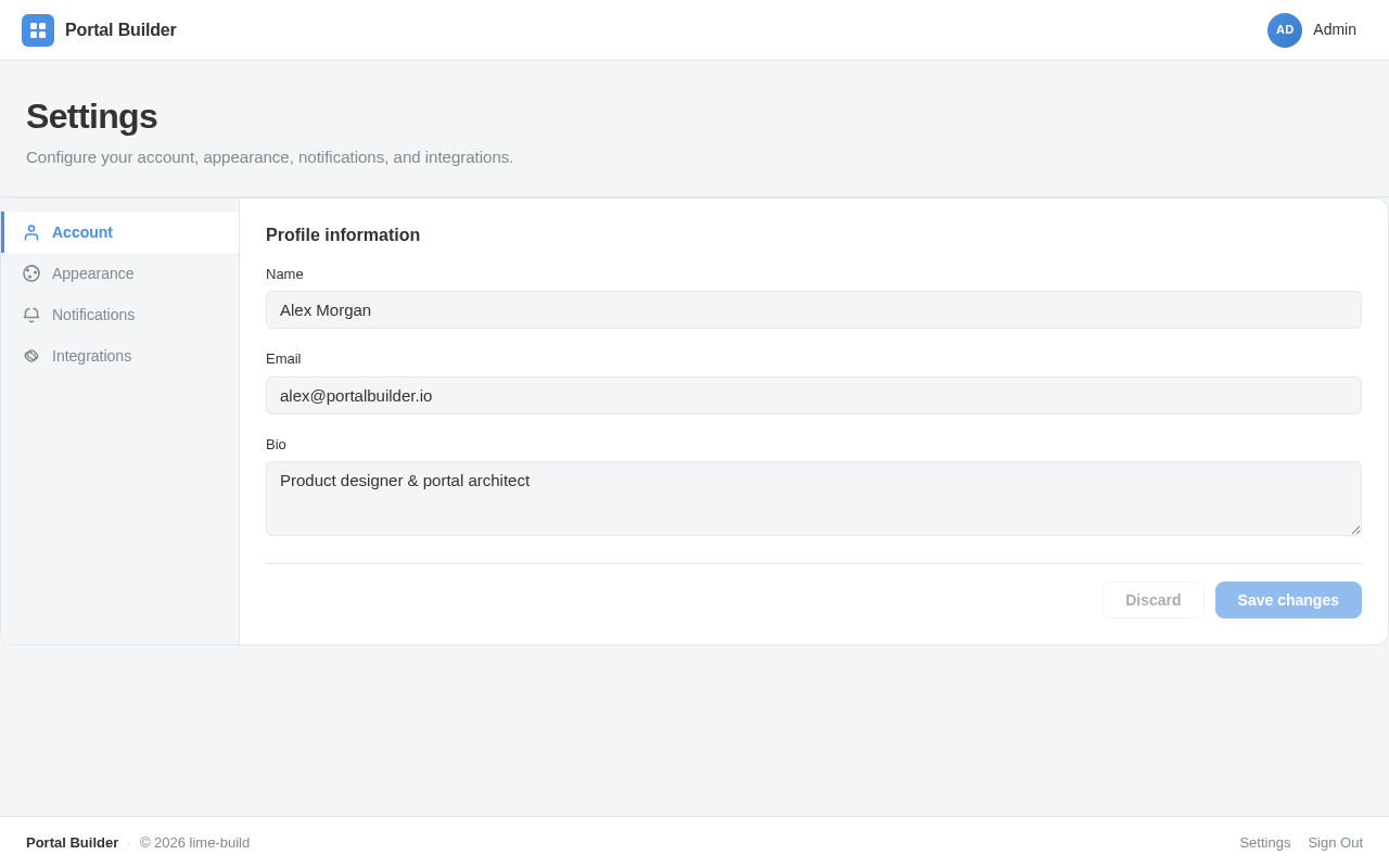
Settings
Configure your account, appearance, notifications, and integrations.

Good morning, User
Build and visualize your next portal.
Quick Start
Recent Projects
4 projectsactive
Employee Payroll Portal
Payroll management portal for processing employee wages, tax deductions, and benefits administration.
active
Client Management Portal
Centralized CRM-style portal for managing client relationships, contracts, and communication history.
active
Healthcare Admin Portal
Administrative portal for healthcare providers to manage patient records, appointments, and staff scheduling.
active
E-commerce Operations Portal
Operations portal for managing inventory, orders, fulfillment, and vendor relationships across the platform.
No comments yet. Be the first!