coral-complete-temp
 Developer infibrain
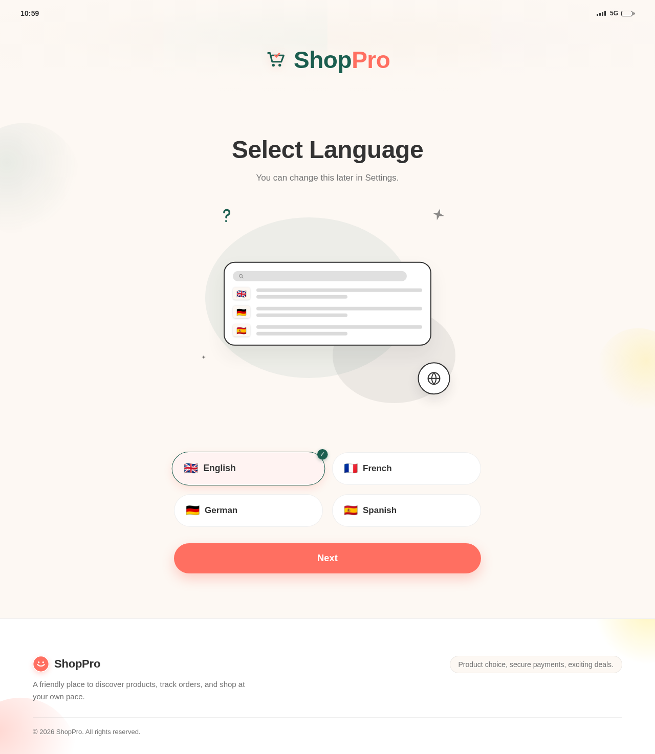
I want you to build the complete Flutter App UI based on this above images: Your task is to inspect the complete Figma file and recreate the entire mobile application UI in Flutter as accurately as possible. ## Goal Create a production-quality Flutter UI that matches the Figma design closely. Do NOT implement only one screen. Inspect all frames/screens in Figma and implement the whole app, including: * Splash * Onboarding * Login/Signup * Home * Detail screens * Profile * Settings * Bottom navigation * Forms * Lists * Cards * Dialogs * Bottom sheets * Tabs * Empty/loading states * Other screens available in Figma Implement every visible Figma screen. ## Technical Requirements Use: * Latest stable Flutter * Dart null safety * Material 3 where suitable * Clean reusable widgets * Responsive UI * Proper navigation * Centralized colors * Centralized typography * Centralized spacing * Organized assets * Clean feature-based architecture Avoid unnecessary third-party packages. If Flutter SDK can handle something, do not add an external dependency. ## First Analyze Figma Before coding, inspect the complete Figma file. Identify: * All screens * Navigation flow * Reusable components * Colors * Fonts * Typography * Spacing * Padding/margins * Border radius * Shadows * Icons * Images * Buttons * Text fields * Cards * Lists * Tabs * Bottom navigation * Dialogs * Bottom sheets * Selected/unselected states First provide a short inventory of screens/components, then immediately start implementation. ## Architecture Use a clean folder structure similar to: lib/ main.dart app.dart core/ constants/ theme/ utils/ widgets/ features/ splash/ onboarding/ auth/ home/ profile/ settings/ Add/remove feature folders based on the actual Figma. Do not place the entire application in one Dart file. Extract reusable components. ## Theme Create centralized theme files such as: core/theme/app_colors.dart core/theme/app_text_styles.dart core/theme/app_theme.dart core/constants/app_spacing.dart core/constants/app_radius.dart core/constants/app_assets.dart Extract the actual Figma colors. Do not scatter hardcoded colors throughout the app. ## Typography Match Figma typography as accurately as possible: * Font family * Font size * Font weight * Line height * Letter spacing * Text colors Create reusable text styles. If the exact font is unavailable, use the closest suitable font and mention the substitution. ## Responsive UI The app must support different mobile screen sizes. Do NOT build the UI by hardcoding the complete Figma screen dimensions like: width: 375 height: 812 Prefer: * Expanded * Flexible * LayoutBuilder * MediaQuery when necessary * AspectRatio * FractionallySizedBox * Constraints * Proper padding Small fixed values are fine for icons, avatars, border radius, etc. The UI must avoid: * RenderFlex overflow * Text clipping * Horizontal overflow * Broken layouts on small devices Support common screen widths such as: 320, 360, 375, 390, 412, 430. ## Reusable Widgets Create reusable widgets for repeated components, for example: AppPrimaryButton AppSecondaryButton AppTextField AppSearchField AppCard AppIconButton AppSectionHeader AppBottomNavigation AppEmptyState AppLoadingPlaceholder Do not duplicate identical UI code across screens. ## Figma Accuracy Match Figma closely, including: * Alignment * Padding * Margins * Font sizes * Font weights * Colors * Backgrounds * Button heights * Field heights * Border radius * Borders * Shadows * Divider thickness * Icon size * Image aspect ratio * Card size * Bottom navigation Do NOT redesign or "improve" the Figma. Reproduce the design. ## Assets Organize assets properly: assets/ images/ icons/ illustrations/ Configure assets in pubspec.yaml. Use the original Figma assets whenever available. If an asset cannot be accessed, add a clear placeholder and TODO with the required asset name. Do not silently replace important artwork with unrelated icons. ## Navigation Implement the user flow shown in Figma. Connect screens through: * Buttons * Cards * Tabs * Bottom navigation * Back buttons * Other interactions Use Flutter Navigator unless another navigation solution is genuinely required. Do not add a heavy routing dependency unnecessarily. ## Forms For forms implement proper: * TextEditingController * Password visibility * Keyboard type * Focus behavior * Validation-ready structure * Prefix/suffix icons * Error UI where shown * Enabled/disabled states Backend/API integration is NOT required yet. ## Lists and Scrolling Use the correct Flutter widget: * ListView * ListView.separated * GridView * CustomScrollView * SliverList * SingleChildScrollView only where suitable Avoid unnecessary nested scroll views. Keep scrolling performant. ## Interactions Implement UI interactions shown or implied in Figma: * Navigation * Tab switching * Bottom navigation * Password show/hide * Checkbox * Radio buttons * Switches * Favorite/bookmark * Quantity buttons * Dropdowns * Dialogs * Bottom sheets * Expand/collapse Use realistic static/mock data where API data would normally appear. Structure mock data so APIs can easily replace it later. ## Loading UI If Figma contains loading/skeleton states, implement them. Avoid third-party shimmer packages unless absolutely necessary. Prefer a lightweight custom Flutter loading animation. Do not duplicate entire screens just to create skeleton loaders. ## Safe Area Handle: * Device notch * Status bar * Bottom gesture/navigation area Use SafeArea only where appropriate so it does not create incorrect Figma spacing. ## Code Quality Follow these rules: * Use const constructors when possible * Avoid giant build() methods * Extract meaningful widgets * Avoid duplicate code * Use descriptive names * Avoid unnecessary abstractions * Avoid excessive magic numbers * Keep code maintainable * Make sure all imports are correct * Make sure the project compiles ## Deliverables Actually create/update the Flutter files. Do not only explain or provide sample code. Implement all Figma screens screen-by-screen. For every screen: 1. Inspect Figma. 2. Build the Flutter screen. 3. Match the design. 4. Extract reusable widgets. 5. Connect navigation. 6. Continue to the next screen. Do not stop after creating a demo or first screen. ## Final Verification Before finishing, verify: * All Figma screens are implemented * No important UI is missing * Navigation works * Colors match * Fonts match * Spacing matches * Assets are configured * UI is responsive * No overflow errors * No duplicated UI code * No unnecessary dependencies * flutter analyze passes * Application compiles successfully Fix all errors and warnings caused by your implementation. You have permission to create, modify, move, delete, and refactor Flutter project files required for this task. Do not repeatedly ask for confirmation. If something in Figma is unclear, make the most reasonable design-matching assumption and continue. Start by inspecting the complete Figma file, list the screens/components briefly, and then build the entire Flutter UI.


Comments (0)
Sign in to leave a comment
ShopPro
Select Language
You can change this later in Settings.
ShopPro
Select Language
You can change this later in Settings.
No comments yet. Be the first!