Wedding
01 — A Monsoon Wedding
Udaipur, RajasthanA three-day celebration across lake palaces and marble courtyards, told through quiet, unposed moments between the ceremony.
 Monish Raj
I am a photographer and I want to create a professional website for my photography business. I am not a designer and I am not technical, so please guide me step by step in simple language. Do not assume that I know UX, UI, development, design systems or technical terms. I want the final website to feel like a premium photography portfolio, not a normal business website. STEP 1 — Understand the business First, help me define the website before designing it. Ask me simple questions about: - What type of photography I do - My main customers - My photography services - My best photography categories - Whether customers need to request a booking or directly book - Whether I want to show pricing - Whether I offer photography packages - Whether customers can contact me through WhatsApp/email - Whether I want to publish stories, blogs or recent shoots If something is not necessary, don't add it. STEP 2 — Website structure Based on my answers, create a simple website structure. The website can include: 1. Home 2. Portfolio 3. Individual Photography Gallery 4. Services / Packages 5. About 6. Testimonials 7. Stories / Journal 8. Booking / Inquiry 9. Contact Do not automatically create every page. Only keep pages that make sense for the photographer. Explain why each page is needed before designing it. STEP 3 — Customer journey Create a simple visitor journey: Discover photographer → Understand photography style → See best work → Explore a complete gallery → Understand services → Build trust through About + Testimonials → Check availability / enquire → Contact or book The website should make it very easy for someone to decide: "I like this photographer. I want to contact them." STEP 4 — VISUAL STYLE Use a modern 2026 premium editorial photography direction. The website should feel: - Elegant - Cinematic - Minimal - Artistic - Premium - Emotional - Image-first Do NOT make it look like: - A generic corporate website - A photography template - A SaaS website - A traditional wedding website - A card-heavy website The photographs should always be the most important visual element. STEP 5 — COLOR SYSTEM Use a sophisticated neutral color palette so the photography remains the focus. Primary background: #F5F3EE — warm photographic white Primary dark: #111111 — deep black for typography and strong contrast Secondary neutral: #D9D4CA — subtle warm neutral for supporting areas Accent: #B58B5A — muted champagne/gold used very sparingly for important details Use the accent only for small highlights, active states, subtle lines or selected CTAs. Do not use gradients. Do not use bright colors. Do not make the website look golden or luxury-fashion themed. The photography should provide most of the color. STEP 6 — TYPOGRAPHY Use a combination of: Primary font: Manrope - Clean - Modern - Highly readable - Use for navigation, body text, buttons and supporting information. Display font: Instrument Serif - Use for large editorial headings and important statements. - Use it selectively so the website feels sophisticated rather than decorative. Typography hierarchy: Large hero heading: 64–80px desktop 40–48px mobile Weight: 400–500 Section heading: 40–52px desktop 32–38px mobile Body: 16–18px Line height around 1.5–1.7 Navigation: 14–15px Medium weight Buttons: 14–15px Medium/Semibold Do not use too many font weights. STEP 7 — HOMEPAGE The homepage should immediately communicate: Who I am What type of photography I create What my visual style is Why someone should explore my work Create a strong image-led hero. Avoid a normal: "Welcome to my photography website" hero. Instead, use a confident editorial statement such as: "Stories, captured honestly." or "Moments that stay with you." Use one powerful photography image or an immersive visual composition. Keep the navigation minimal. Example: Logo | Work | Services | About | Contact | Enquire The main CTA should be: "Enquire" not a generic "Get Started" button. STEP 8 — PORTFOLIO Do not create a boring 3-column image grid. Create a visually interesting editorial portfolio. Photography categories can be displayed through different image sizes and compositions. For example: Weddings Portraits Travel Editorial Events Each category should feel like entering a visual story. Use large images, asymmetric layouts and generous whitespace. When the user selects a category, show a dedicated gallery. STEP 9 — PHOTOGRAPHY DETAIL PAGE This page is extremely important. When someone opens a photography project, make it feel like an editorial story. Include: Project title Location Date Photography category Short story/context Large photography Image sequence Supporting text where useful Related work CTA to enquire Do not put every image inside identical cards. Allow images to have different sizes and visual rhythm. STEP 10 — SERVICES Present photography services clearly. Examples: Wedding Photography Portrait Photography Commercial Photography Event Photography Travel / Editorial Each service should explain: What is included Who it is for Approximate package information if provided How to enquire Use clear CTAs. STEP 11 — ABOUT Make this personal. Photography is about the person behind the camera, so the About page should not feel like a corporate company profile. Include: Photographer portrait Short personal story Photography philosophy Experience Approach to working with clients Make it warm and human. STEP 12 — BOOKING / ENQUIRY Keep the form simple. Ask only useful information: Name Email / Phone Photography type Preferred date Location Approximate requirements Message Primary CTA: "Send Enquiry" After submission, show a clear confirmation message. STEP 13 — INTERACTIONS Use subtle interactions that make the website feel premium. Examples: - Smooth image transitions - Gentle hover effects - Image reveal animations - Subtle page transitions - Elegant scrolling - Navigation that changes naturally while scrolling - Portfolio image hover previews Do NOT overuse animation. The photography should remain the focus. STEP 14 — RESPONSIVE DESIGN The website must work beautifully on: Desktop Tablet Mobile On mobile, prioritize the photography and content rather than simply shrinking the desktop layout. Use appropriate image cropping and spacing for mobile. STEP 15 — FINAL DESIGN DIRECTION The final result should feel closer to a modern independent creative studio, editorial magazine and premium photography portfolio than a traditional photographer website. Think: large photography + editorial typography + strong whitespace + sophisticated neutrals + subtle interactions + emotional storytelling + simple navigation + clear enquiry journey The final website should feel intentional and art-directed. Most importantly: Do not start by generating random screens. First understand the business, establish the structure and user journey, then define the visual direction, and finally generate the design. I am a non-designer. Explain each major decision in simple human language before moving to the next step.


Sign in to leave a comment
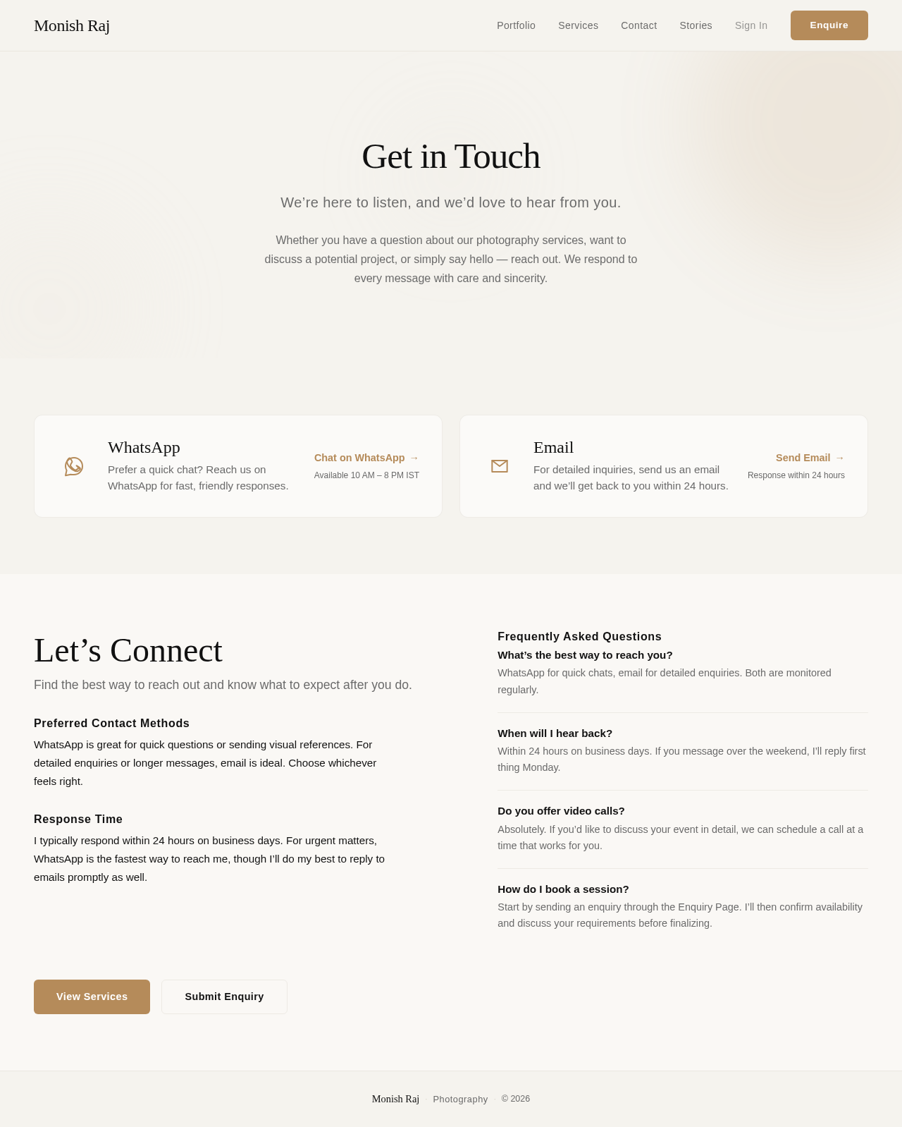
We’re here to listen, and we’d love to hear from you.
Whether you have a question about our photography services, want to discuss a potential project, or simply say hello — reach out. We respond to every message with care and sincerity.
Find the best way to reach out and know what to expect after you do.
WhatsApp is great for quick questions or sending visual references. For detailed enquiries or longer messages, email is ideal. Choose whichever feels right.
I typically respond within 24 hours on business days. For urgent matters, WhatsApp is the fastest way to reach me, though I’ll do my best to reply to emails promptly as well.
WhatsApp for quick chats, email for detailed enquiries. Both are monitored regularly.
Within 24 hours on business days. If you message over the weekend, I’ll reply first thing Monday.
Absolutely. If you’d like to discuss your event in detail, we can schedule a call at a time that works for you.
Start by sending an enquiry through the Enquiry Page. I’ll then confirm availability and discuss your requirements before finalizing.
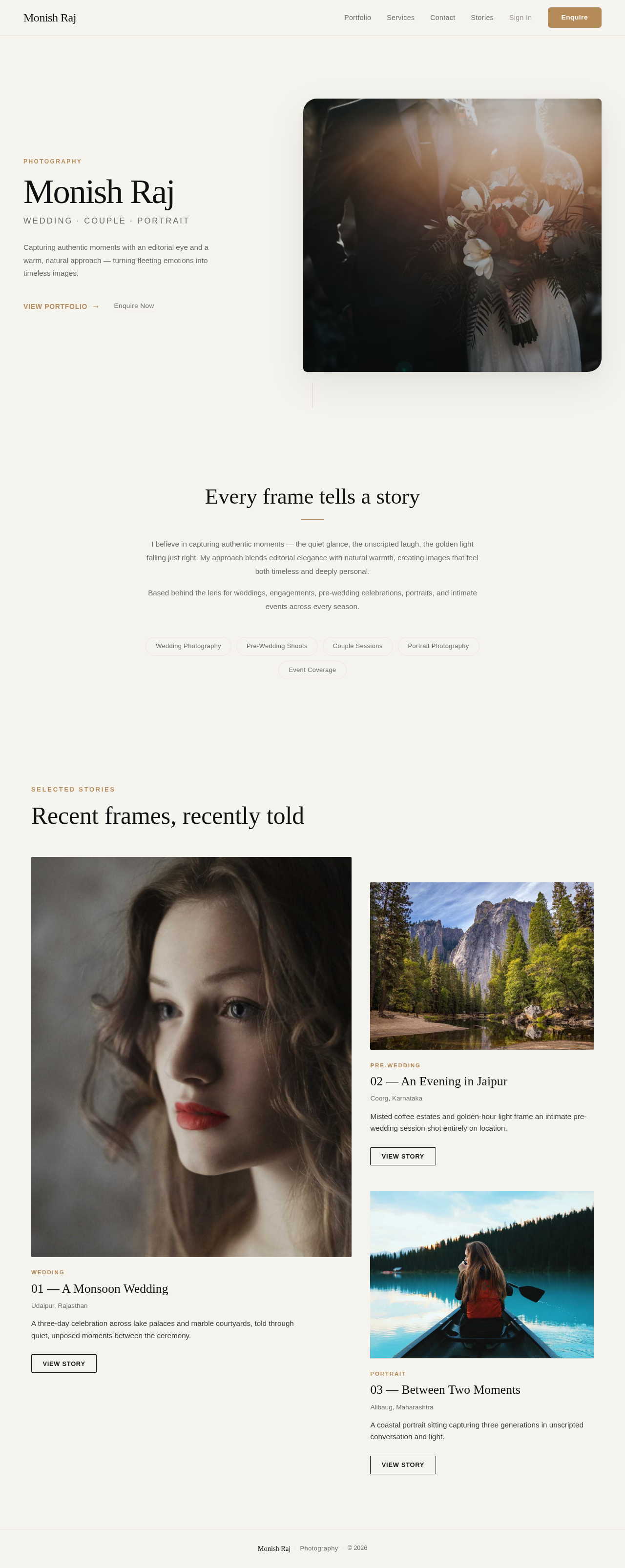
Photography
Wedding · Couple · Portrait
Capturing authentic moments with an editorial eye and a warm, natural approach — turning fleeting emotions into timeless images.

I believe in capturing authentic moments — the quiet glance, the unscripted laugh, the golden light falling just right. My approach blends editorial elegance with natural warmth, creating images that feel both timeless and deeply personal.
Based behind the lens for weddings, engagements, pre-wedding celebrations, portraits, and intimate events across every season.
No comments yet. Be the first!