Inzait Pro video edit & photo edit
 SAMEED1234BHAI
Create a professional video editing mobile app like CapCut. App Name: EditX Pro Features: - Import videos and images from gallery - Timeline based editing (cut, trim, split) - Add transitions between clips - Add background music and sound effects - Add text, captions, and subtitles with different fonts - Apply filters, color grading, and effects - Speed control (slow motion & fast motion) - Add stickers and overlays - Export video in HD (720p, 1080p) UI Design: - Dark modern UI (black + blue theme) - Simple and beginner-friendly interface - Smooth animations and fast performance Extra Features: - Auto captions using AI - One-click video enhancement - Trending templates like reels/shorts Platform: - Android app Goal: Make it fast, user-friendly, and similar to CapCut but with unique design.


Comments (0)
Sign in to leave a comment
Project Tasks121
Implement NavBar for Splash
As a frontend developer, implement the NavBar section for the Splash page. The NavBar component uses useState for scrolled (window.scrollY > 12 triggers nb-scrolled class) and menuOpen state. Includes a diamond-shaped logo icon with 'emerald-video' branding, desktop nav links (Home, Gallery, Templates, Editor, Dashboard), a 'Get Started Free' CTA linking to /Signup, and an animated hamburger button (3 span lines with nb-open class toggle). A full-screen mobile drawer aside (#nb-mobile-drawer) slides in with an overlay backdrop. The component uses passive scroll event listeners and ResizeObserver cleanup. Note: this is a new NavBar component specific to this project (not reusing infini-editor's Navbar).
Auth API Endpoints
Implement FastAPI authentication endpoints: POST /auth/register, POST /auth/login, POST /auth/logout, POST /auth/refresh-token, POST /auth/forgot-password, POST /auth/reset-password. Use JWT tokens with access/refresh token pattern. Integrate with MySQL for user storage. Required by frontend pages: Signup, Login, Dashboard, Settings, Users.
MySQL Schema & Migrations
Design and implement MySQL database schema with Alembic migrations for: users table (id, email, password_hash, name, role, status, created_at, updated_at), projects table (id, user_id, title, status, settings_json, created_at), templates table (id, title, category, tags, preview_url, created_by), media_files table (id, user_id, type, url, metadata_json, created_at), export_jobs table (id, project_id, status, format, quality, output_url, created_at), user_settings table (id, user_id, settings_json). Seed initial admin user and sample templates.
MongoDB Collections Setup
Design and implement MongoDB collections for: project_timelines (project_id, clips array, tracks, keyframes, audio_settings), ai_results (job_id, type, video_id, output_data, metadata), captions (video_id, language, segments array), activity_logs (user_id, action, timestamp, details), user_preferences (user_id, appearance, notifications config). Create indexes for performance. Add seed data for demo projects.
API Gateway & CORS Setup
Configure FastAPI application-level CORS middleware, rate limiting (slowapi), request logging, error handling middleware, and API versioning (/api/v1 prefix). Set up environment-based configuration (development/staging/production) using Pydantic settings. Configure JWT secret rotation and token blacklist for logout. Implement health check endpoint GET /health.
Celery Task Queue Setup
Set up Celery with Redis as broker for async video processing tasks. Configure task queues: video_export, ai_processing, media_upload. Implement retry logic, task status tracking, and result backend. Add Flower monitoring dashboard. Required by export and all AI processing services to handle long-running jobs without blocking API responses.
File Storage Service Setup
Configure file storage service for media uploads and exports. Implement storage abstraction layer supporting local filesystem (dev) and S3-compatible object storage (production). Set up upload size limits (4K video support), MIME type validation, virus scanning hook, and CDN URL generation. Configure cleanup jobs for temporary processing files.
Global State Management Setup
Set up Redux Toolkit or Zustand global state management for React Native app. Define stores for: auth state (user, tokens, permissions), editor state (project, timeline, clips, playhead), ui state (theme, active page, modals), ai jobs state (pending/completed AI tasks). Configure persistence for auth tokens (SecureStore). Required by Editor Timeline, AI features, and cross-page navigation.
Design System & Theme Setup
Implement global design system for React Native: define theme tokens (colors: #FF4FD8 primary, #4F9DFF secondary, #FFD700 accent, #FFFFFF background), typography scale, spacing system, and shadow styles. Create base UI components: Button, Input, Modal, Toast, Badge, Avatar, ProgressBar, Toggle. Configure react-native-reanimated and react-native-gesture-handler. Add GSAP-equivalent animation utilities for micro-interactions as specified in SRD Section 6.
Gallery Media API
Implement FastAPI endpoints for gallery media management: list, filter, paginate, tag, delete, and bulk-action on user media assets. Support filtering by type (video/photo), date range, tags, and project association.
Gallery Page NavBar
Build the top navigation bar component for the Gallery page in React Native, consistent with the app design system. Includes logo, search icon, notifications bell, and user avatar with navigation to other pages.
Gallery Media Upload Modal
Build the media upload modal/bottom-sheet component for the Gallery page in React Native. Supports picking from device library, drag-and-drop, upload progress indicator, and error handling. Integrates with the Media Upload/Management API.
Gallery Page Footer
Build the bottom tab bar / footer navigation component for the Gallery page in React Native. Consistent with app navigation, includes active state styling and quick-action FAB for new upload.
Templates Page NavBar
Build the top navigation bar component for the Templates page in React Native, consistent with the design system. Includes back/home navigation, page title, and search icon.
Templates Page Header
Build the hero/header section for the Templates page in React Native. Includes featured templates banner, page title, subtitle, and a prominent search bar for template discovery.
Templates Category Filter
Build the horizontal scrollable category filter chip row for the Templates page in React Native. Categories include All, Trending, Social Media, Business, Wedding, Sports, etc. Tapping a chip filters the template grid.
Templates Page Footer
Build the bottom tab bar / footer navigation component for the Templates page in React Native, consistent with app-wide footer pattern and active state for Templates tab.
Login Page NavBar
Build the minimal top navigation bar for the Login page in React Native. Includes app logo/wordmark and optional back arrow for navigation from signup or splash screens.
Login Page Hero Illustration
Build the hero/illustration section for the Login page in React Native. Displays a branded animated or static illustration/lottie highlighting key app features, used above the login form to reinforce value proposition.
Login Page Login Form
Build the login form component for the Login page in React Native. Includes email/username and password fields with validation, show/hide password toggle, Forgot Password link, and a primary Login button. Integrates with the Auth API and global auth state.
Login Page Social Login
Build the social login section for the Login page in React Native. Includes OAuth buttons for Google and Apple Sign-In, a divider with 'or continue with', and a Sign Up redirect link. Integrates with Auth API social endpoints.
Login Page Footer
Build the footer for the Login page in React Native. Includes Terms of Service, Privacy Policy links, and copyright text. Minimal styling consistent with the design system.
Redis Cache & Broker Setup
Provision and configure Redis as a standalone service in Docker Compose and Kubernetes. Used as the Celery message broker, result backend, and general-purpose cache for API rate limiting and session data. Include connection pooling, eviction policy, and health check configuration.
LiteLLM Router Configuration
Set up and configure the LiteLLM router/proxy to unify access to GPT-5.4, Claude 4.6 Opus, and Google Nano Banana (image generation) under a single OpenAI-compatible API surface. Configure model routing rules, fallback chains, load balancing, cost tracking, and API key management via environment variables.
Push Notifications Infrastructure
Set up mobile push notification infrastructure for React Native using Firebase Cloud Messaging (FCM) for Android and Apple Push Notification Service (APNs) for iOS. Configure the backend FastAPI service to send push notifications via FCM/APNs, store device tokens in the database, and integrate with the Notifications API. Include notification permission handling in the React Native app.
React Native CI/CD Pipeline
Set up a CI/CD pipeline for the React Native mobile app using GitHub Actions or equivalent. Automates: dependency install, lint, unit tests, iOS build (Xcode), Android build (Gradle), artifact upload, and conditional deployment to TestFlight (iOS) and Play Store internal track (Android) on merge to main.
Social OAuth API Endpoints
Implement Google OAuth 2.0 and Apple Sign-In backend endpoints in FastAPI. Handle token validation, user creation or lookup, JWT issuance, and account linking for users who sign in via social providers. Required to support the Login page SocialLogin component.
Media CDN & Streaming Setup
Configure a CDN (e.g., CloudFront or equivalent) in front of the file storage service for low-latency delivery of video and image assets globally. Set up signed URL generation for secure media access, configure cache policies for different asset types, and enable adaptive bitrate video streaming (HLS) for playback in the Gallery and Editor.
Logging & Monitoring Setup
Set up centralized structured logging (e.g., ELK stack or Loki+Grafana) and application performance monitoring (APM) for the FastAPI backend and AI microservices. Configure log aggregation, error alerting, and dashboards for key metrics: request latency, error rate, Celery task queue depth, and AI service response times.
Implement Hero for Splash
As a frontend developer, implement the Hero section for the Splash page. Uses a canvas-based star field animation with 180 stars (STAR_COUNT) rendered via requestAnimationFrame. Each star has randomized color (magenta/cyan/golden/white rgba values), opacity sinusoidal pulsing, sparkle cross-arm effects triggered by sparkleTimer/sparkleInterval, and radial gradient glow fills. The canvasRef and animRef manage the animation loop; ResizeObserver handles DPR-aware canvas resizing. The hero content overlays the canvas with headline text, subheadline, and CTA buttons positioned above the star field via z-index layering.
Implement GalaxyFeatures for Splash
As a frontend developer, implement the GalaxyFeatures section for the Splash page. Renders 6 feature cards (Timeline Editing, AI Captions, Filters & Effects, Transitions, Music Library, Speed Control) each with accent color variants (magenta/cyan/golden). Uses IntersectionObserver with threshold 0.12 to trigger gf-visible class on scroll with staggered delays via data-delay attributes. handleRipple callback creates DOM ripple spans on click with accent-mapped rgba colors. Each card includes icon, title, desc, and tag badge. cardRefs array tracks all 6 card DOM nodes for observer and ripple targeting.
Implement ValueProposition for Splash
As a frontend developer, implement the ValueProposition section for the Splash page. Uses IntersectionObserver (threshold 0.15) with useState visible flag to trigger reveal animations. Left column renders 3 benefit items (Lightning Speed, Pro-Grade Power, Creator Simplicity) each with icon-wrap, title, and desc inside vp-benefit divs with key-specific classNames (vp-speed, vp-power, vp-simplicity). Right column is an animated phone mockup with 3 layered orb divs (vp-orb-1/2/3), a vp-phone-frame containing vp-phone-notch and vp-phone-screen with a vp-screen-topbar. Background has 3 decorative glow divs (vp-glow-1/2/3). Headline uses vp-headline-gradient span for accent text.
Implement AIHighlights for Splash
As a frontend developer, implement the AIHighlights section for the Splash page. Imports Captions, Sparkles, LayoutTemplate, ArrowRight, Wand2, Mic2 from lucide-react. Renders 3 AI feature cards (Auto Captions, One-Click Enhancement, Smart Templates) with useState activeIndex tracking the selected card. handleCardClick sets activeIndex and creates a DOM ripple span (aih-ripple) sized at 1.5x max(width,height) positioned at click coordinates, auto-removed after 650ms. Each card has tag badge with tagIcon, title, description, lucide icon, and href link. cardRefs array references all card DOM nodes. Header includes aih-badge with animated aih-badge-spark and aih-title-accent gradient span.
Implement TemplateShowcase for Splash
As a frontend developer, implement the TemplateShowcase section for the Splash page. Imports both TemplateCard.css and TemplateShowcase.css. Renders 8 template cards (Vibe Reel, Cinematic Short, Dance Sync, Aesthetic Story, Product Reveal, Travel Montage, Feed Glow, Recipe Reel) with per-card gradient backgrounds, accentColor, format badges (ts-format-reel/short/tiktok/story/square), hot/trending/new badges with emoji icons, and creator count stats. Uses useState for active/hovered card tracking, useRef for carousel DOM, useEffect for scroll-based active index calculation. ChevronLeft/ChevronRight from lucide-react power prev/next navigation buttons. Play, Zap, TrendingUp, Sparkles icons used for card UI elements. Carousel supports both button navigation and drag/scroll with smooth behavior.
Implement TrustBadges for Splash
As a frontend developer, implement the TrustBadges section for the Splash page. Renders 3 stat cards (2.4M+ Downloads, 4.9/5 Rating, 180K+ Active Creators) each with per-card colorVar/glowVar/borderVar/bgVar inline style variables. Testimonials carousel (Sofia Reyes, Marcus Chen, Aaliyah Brooks) uses useRef carouselRef with scroll event listener tracking activeIndex via cardWidth calculation (scrollWidth / testimonials.length). scrollToCard() uses smooth scrollTo behavior. Dot indicators below carousel trigger scrollToCard on click. 4 trust badge pills (Secure & Private, Fast Export, AI Powered, Mobile First) rendered at bottom. useState manages activeIndex, useEffect attaches/cleans scroll listener on carouselRef.
Implement CallToAction for Splash
As a frontend developer, implement the CallToAction section for the Splash page. Uses useState for email string and showToast/toastMsg toast notification state. useRef tracks btnRef for ripple targeting and toastTimerRef for 3200ms auto-dismiss. triggerRipple useCallback creates cta-ripple DOM span sized at max(width,height) at click coordinates, removed on animationend. handlePrimaryClick validates email regex (/^[^\s@]+@[^\s@]+\.[^\s@]+$/) — valid email shows welcome toast and clears input, invalid shows error toast, empty email redirects to /Signup. 5 FEATURE_CHIPS (AI Auto Captions, HD Export, Music Library, Trending Templates, Free to Start) rendered as pill badges. 4 AVATARS (A/M/K/J) with gradient classes cta-avatar-1 through cta-avatar-4. Animated background with cta-bg-gradient, cta-bg-radial, fades, and 3 cta-orb divs.
Implement Footer for Splash
As a frontend developer, implement the Footer section for the Splash page. Renders 3 link columns: productLinks (Video Editor, Templates, Gallery, Export Tools, Dashboard), companyLinks (About Us, Careers, Blog, Press Kit), and resourceLinks (Help Center, Tutorials, Community, API Docs, Status). Social links row includes 5 platforms (TikTok with cyan SVG, Instagram with magenta stroke SVG, YouTube with red fill SVG, X/Twitter with cyan path SVG, Discord with purple path SVG) each with per-platform CSS class (ftr-social-tiktok/instagram/youtube/twitter/discord). Component is a pure functional component with no state, importing only Footer.css. All company/resource links currently point to /Splash as placeholder hrefs.
Implement NavBar for Signup
As a frontend developer, implement the NavBar section for the Signup page. This component may already exist from the Splash page implementation — reuse or extend the shared NavBar component. Uses useState for `scrolled` and `menuOpen` state, useEffect to add a passive scroll listener that toggles `nb-scrolled` class at 24px scroll depth, and a second useEffect to lock body scroll when mobile menu is open. Renders a LogoIcon SVG, NAV_LINKS array (Home, Templates, Gallery, Editor, Dashboard) as desktop nav with active-path detection via window.location.pathname, a 'Get Started' CTA button linking to /Signup, a hamburger button with aria-expanded toggling `nb-open` class and `nb-hamburger` styles, a `nb-magenta-line` shimmer accent div, and a mobile overlay drawer with id `nb-mobile-drawer`. Imports NavBar.css.
Users CRUD API
Implement FastAPI user management endpoints: GET /users, GET /users/{id}, POST /users, PUT /users/{id}, DELETE /users/{id}, PATCH /users/{id}/status, PATCH /users/{id}/role, GET /users/{id}/activity, GET /users/{id}/permissions, PUT /users/{id}/permissions. Supports pagination, filtering by role/status/join date, sorting. Required by frontend Users page tasks.
Projects CRUD API
Implement FastAPI project/video project endpoints: GET /projects, POST /projects, GET /projects/{id}, PUT /projects/{id}, DELETE /projects/{id}, POST /projects/{id}/duplicate. Store project metadata (clips, timeline state, settings) in MongoDB. MySQL for relational metadata. Required by Dashboard RecentProjects and Editor pages.
Templates API Endpoints
Implement FastAPI template management endpoints: GET /templates (with category/tag filters), GET /templates/{id}, POST /templates (admin), PUT /templates/{id} (admin), DELETE /templates/{id} (admin), POST /templates/{id}/use. Store template metadata in MySQL, template assets references in MongoDB. Required by Templates and Dashboard pages.
Media Upload/Management API
Implement FastAPI media endpoints: POST /media/upload (multipart video/image upload), GET /media, GET /media/{id}, DELETE /media/{id}, POST /media/import-gallery. Handle file storage (local/S3), generate thumbnails on upload, store metadata in MySQL. Required by Gallery, Editor, and Export pages.
User Settings API
Implement FastAPI settings endpoints: GET /settings/profile, PUT /settings/profile, PUT /settings/password, GET /settings/appearance, PUT /settings/appearance, GET /settings/notifications, PUT /settings/notifications, GET /settings/privacy, PUT /settings/privacy, DELETE /settings/account, POST /settings/export-data. Required by Settings page tasks.
Analytics & Activity Log API
Implement FastAPI analytics endpoints: GET /analytics/dashboard (user stats, project counts, storage used), POST /activity/log (record user action), GET /activity/logs (filtered by user, type, date range), GET /admin/analytics (admin dashboard metrics). Used by Dashboard QuickStats, ActivityFeed, and Users ActivityLog sections.
Frontend API Client Setup
Set up React Native API client layer: configure axios/fetch with base URL, JWT token interceptor (auto-attach Authorization header), refresh token rotation on 401, global error handling, and request/response logging in dev mode. Create typed API service modules for each domain (auth, users, projects, media, ai, settings, templates). Add React Query or Redux Toolkit Query for server state caching.
React Native Navigation Setup
Configure React Navigation (v6) with stack and tab navigators for all 11 pages: Splash, Login, Signup, Home/Dashboard, Templates, Gallery, Editor, Export, Settings, Users. Implement deep linking, auth-guarded routes (redirect to Login if no token), and transition animations. Set up navigation state persistence. Integrates with global auth state.
Notifications API
Implement FastAPI notifications endpoints: GET /notifications (list with read/unread filter), POST /notifications/{id}/read, POST /notifications/read-all, DELETE /notifications/{id}. Support notification types: export_complete, ai_captions_ready, template_updates, system_alerts. Store in MySQL. Required by Dashboard NavBar notifications dropdown and Settings NotificationPrefs section.
Gallery Media Grid
Build the main media grid/mosaic component for the Gallery page in React Native. Displays video thumbnails and photos in a responsive grid with infinite scroll pagination, multi-select support, and play-icon overlay for videos.
Gallery Filter & Search Bar
Build the filter and search bar component for the Gallery page in React Native. Includes text search input, filter chips (All, Videos, Photos, Favorites), date range picker, and sort dropdown.
Templates Grid Filtered List
Build the main template grid/list component for the Templates page in React Native. Displays template cards with preview thumbnail, name, duration, category badge, and use/preview buttons. Supports infinite scroll and real-time filter updates.
Langchain Workflow Setup
Scaffold the Langchain integration layer for orchestrating multi-step AI workflows: caption generation pipeline, scene-to-edit suggestion chain, translation chain, and thumbnail prompt generation. Configure chains, memory, and tool integrations routed through LiteLLM.
iOS App Store Deployment
Configure and document the iOS App Store submission pipeline for Inzait Pro. Includes Apple Developer account setup, provisioning profiles, code signing configuration, App Store Connect metadata (screenshots, description, category), and submission via Fastlane or Xcode CLI. Covers TestFlight beta distribution setup.
Android Play Store Deployment
Configure and document the Google Play Store submission pipeline for Inzait Pro. Includes Google Play Console setup, signing keystore configuration, AAB build generation, store listing metadata (screenshots, description, content rating), and submission via Fastlane or Gradle CLI. Covers internal and closed testing tracks.
Password Reset API
Implement forgot-password and password-reset FastAPI endpoints. Includes email-based OTP or token generation, secure token storage (Redis with TTL), and password update with validation. Required for the Login page Forgot Password flow.
API Rate Limiting Middleware
Implement request rate limiting middleware for the FastAPI backend using Redis as the counter store. Apply per-user and per-IP rate limits on all API routes, with stricter limits on AI invocation and media upload endpoints. Return standard 429 responses with Retry-After headers.
Implement Hero for Signup
As a frontend developer, implement the Hero section for the Signup page. Uses a canvas-based animated starfield rendered via useRef (canvasRef, starsRef, rafRef) and useCallback for initStars. Generates 140 stars with randomized x/y/r/phase/speed/color (30% magenta #FF6FD8, 40% cyan #00D9FF, rest white) and glow/ray flags. Animation loop runs via requestAnimationFrame, draws CONSTELLATION_PAIRS as faint white lines (strokeStyle rgba(255,255,255,0.045), lineWidth 0.5), then draws each star with radial gradient glow, pulsing alpha/size via Math.sin, and optional ray-cross effect for 15% of stars. ResizeObserver handles DPR-aware canvas resizing and star reinit. Imports Hero.css.
Implement ValueProposition for Signup
As a frontend developer, implement the ValueProposition section for the Signup page. This component may already exist from the Splash page — reuse or extend as needed. Renders three feature cards defined in the PROPS array using lucide-react icons (Sparkles for 'AI-Powered', Zap for 'One-Click Enhancement', LayoutGrid for 'Template Library') with colorKey variants: cyan, magenta, gold. Uses useRef for headerRef and cardRefs array, and IntersectionObserver (threshold 0.12, rootMargin '0px 0px -40px 0px') to add `vp-visible` class on scroll-entry for fade-in animations. Each card renders a vp-icon-wrap with icon + vp-icon-ring, a vp-prop-badge with badge-dot, title, and description text. Includes vp-bg-glow decorative div and vp-eyebrow header with flanking line spans. Imports ValueProposition.css.
Implement SignupForm for Signup
As a frontend developer, implement the SignupForm section for the Signup page. This is the core interactive form component with multiple useState hooks: email, password, confirmPassword, termsAccepted, showPassword, showConfirmPassword, errors, touched, submitting, and submitted. Includes getPasswordStrength() scoring function (checks length ≥8, uppercase, digits, special chars returning 0–4) and strengthLabel()/strengthClass() helpers for 4-segment strength bar UI. Uses lucide-react icons: Mail, Lock, Eye, EyeOff, CheckCircle, AlertCircle, Check. Implements validate() for all fields including email regex, min-length, password match, and terms checkbox. handleBlur() sets touched state and triggers validation. handleSubmit() prevents default, marks all fields touched, validates, simulates async submission with setSubmitting/setSubmitted. getFieldClass() applies sf-error/sf-success classes conditionally. Password fields have toggle-visibility buttons. Renders a success state when submitted=true. Imports SignupForm.css.
Implement SocialProof for Signup
As a frontend developer, implement the SocialProof section for the Signup page. Renders three StatCard components using a STATS array (500K+ Active Creators with cyan line, 4.8★ Rating with gold line, 10M+ Videos Created with magenta line). Implements a custom useCountUp hook using requestAnimationFrame with cubic ease-out (1 - Math.pow(1 - progress, 3)) over 1800ms duration, triggered by an IntersectionObserver (threshold 0.2) that sets `visible` state once and then disconnects. StatCard applies CSS custom property `--sp-line-color` per stat and staggered `animationDelay` of index × 0.12s when visible. Section background includes sp-bg-glow-left and sp-bg-glow-right decorative divs. Imports SocialProof.css.
Implement FeaturePreview for Signup
As a frontend developer, implement the FeaturePreview section for the Signup page. Renders an interactive feature tab UI using a `features` array of 4 items (Timeline Editor, AI Captions, Trending Templates, One-Click Export) with lucide-react icons (Layers, Captions, LayoutTemplate, Download) and badge labels (Pro, AI, New, Fast). Uses useState for active tab index and useRef/useEffect for intersection-based reveal animations. Renders four distinct preview sub-components: TimelinePreview (fp-tl-playhead, three fp-tl-row tracks for Video/Audio/Text with animated fill bars), CaptionsPreview (fp-cap-ai-badge, fp-cap-line rows with fp-cap-bar segments and fp-cap-cursor), TemplatesPreview (fp-tmpl-thumb grid), and an ExportPreview. Additional lucide icons used: Play, Zap, Film, Sparkles. Imports FeaturePreview.css.
Implement SecurityTrust for Signup
As a frontend developer, implement the SecurityTrust section for the Signup page. Renders three trust badge cards defined in the BADGES array: 'Bank-Level Encryption' (cyan variant, AES-256 messaging, SSL Secured label), '100% Private Data' (magenta variant, zero data sale messaging), and 'GDPR Compliant' (cyan variant, EU Certified label). Each badge card includes an inline SVG icon (lock, shield, info-circle), a variant-based color class (st-badge--cyan / st-badge--magenta), a CheckIcon SVG showing a circled checkmark for the verified label, and descriptive sub-text. Also renders a CheckIcon helper component and a ShieldSmall SVG used in a tagline element. All SVGs use stroke-based rendering with brand colors #00D9FF and #FF6FD8. Imports SecurityTrust.css.
Implement CallToActionBottom for Signup
As a frontend developer, implement the CallToActionBottom section for the Signup page. Uses a canvas-based animated starfield via useRef (canvasRef, animRef) with 90 stars alternating cyan (rgba(0,217,255)) and magenta (rgba(255,111,216)) colors. Animation loop uses requestAnimationFrame, each star pulses alpha via Math.sin with individual speed/phase, and stars with alpha >0.6 and r >1 render an additional glow circle at 2.5× radius. ResizeObserver handles DPR-aware resize. Decorative ctab-divider, ctab-glow-cyan, and ctab-glow-magenta divs frame the canvas. Content layer includes a ctab-badge with animated dot and 'Start Creating Today' label, an h2 headline with ctab-headline-gradient span on 'Create?', a description paragraph about joining creators, and two CTA buttons: 'Sign Up Free' (ctab-btn-signup with arrow icon) linking to /Signup. Imports CallToActionBottom.css.
Implement Footer for Signup
As a frontend developer, implement the Footer section for the Signup page. This component may already exist from the Splash page — reuse or extend as needed. Renders five social icon SVG components: TwitterIcon, InstagramIcon, YoutubeIcon, TiktokIcon, DiscordIcon — all using fill='currentColor' and aria-hidden. Footer includes brand logo/tagline, navigation link columns (product, company, legal), social media icon row, and copyright text. All SVG icons use standard viewBox='0 0 24 24' with brand-accurate paths. Imports Footer.css.
Video Export API
Implement FastAPI video export endpoints: POST /export/start (accepts project_id, quality, format, advanced options), GET /export/{job_id}/status (SSE or polling for progress), GET /export/{job_id}/download, POST /export/{job_id}/cancel. Use background task queue (Celery/FastAPI BackgroundTasks) for async processing. Required by Export page tasks.
AI Captions Service
Implement AI auto-captions and caption translation microservice using FastAPI + Langchain. Endpoints: POST /ai/captions/generate (video_id, language), POST /ai/captions/translate (caption_id, target_language). Integrate with speech-to-text model. Support 30+ languages. Store captions in MongoDB. Uses Litellm for LLM routing. Required by Editor AI Captions feature.
AI Scene Detection Service
Implement AI scene detection microservice: POST /ai/scene-detection (video_id) returns detected scene timestamps and segments. Use computer vision model for key scene identification. Integrate with Langchain for workflow orchestration. Store results in MongoDB. Required by Editor AI Scene Detection feature.
AI Video Enhancement Service
Implement AI video enhancement microservice: POST /ai/enhance (video_id, type: color_correction|noise_cancel|upscale|auto_edit). Handles AI Color Correction, AI Noise Cancellation, AI Video Enhancer (HD/4K upscaling), and AI Auto Edit. Uses GPU-accelerated processing pipeline. Store job status in MySQL, results reference in MongoDB.
AI Thumbnail Generator Service
Implement AI thumbnail generation microservice: POST /ai/thumbnail/generate (video_id, count: 1-5) returns generated thumbnail image URLs. Use Google Nano Banana model for image generation as specified in SRD tech stack. Store generated thumbnails via media service. Required by Editor AI Thumbnail Generator feature.
AI Lip Sync Service
Implement AI lip sync microservice: POST /ai/lipsync (video_id, audio_id) returns processed video with synchronized lip movements. Handles smooth audio-video synchronization using AI model. Store job status and output in media service. Required by Editor AI Lip Sync feature.
AI Cartoon/Avatar Filter Service
Implement AI cartoon and avatar filter microservice: POST /ai/cartoon-filter (video_id, style: cartoon|avatar|anime) returns stylized video. Applies AI-powered visual transformation to convert video to cartoon-like aesthetics. Store processing job and output reference in MongoDB.
AI Motion Tracking Service
Implement AI motion tracking microservice: POST /ai/motion-tracking (video_id, object_id) returns tracking data (bounding boxes per frame). Enables intelligent object tracking for effects overlay. Store tracking metadata in MongoDB for use by editor timeline. Required by Editor AI Motion Tracking feature.
Gallery Media Preview Lightbox
Build the media preview/lightbox component for the Gallery page in React Native. Full-screen preview for photos and videos with swipe navigation, share, download, delete, and edit (open in editor) actions.
Templates Preview Modal
Build the template preview modal/bottom-sheet for the Templates page in React Native. Plays a looping preview video of the template, shows name, category, duration, and AI features used, with Use Template and Close actions.
AI Integration Routing Layer
Build the internal API routing layer that connects frontend AI feature requests (captions, scene detection, thumbnail, lip sync, etc.) to the correct AI microservices and Langchain workflows. Implements a unified /ai/invoke endpoint with feature-key dispatch, async job queuing via Celery, and status polling endpoints.
AI Caption Translation Service
Implement the AI-powered caption translation microservice. Uses LiteLLM (GPT-5.4 or Claude 4.6 Opus) via Langchain to translate generated captions into target languages selected by the user. Integrates with the captions service output and returns translated SRT/VTT files.
AI Auto Edit Service
Implement the AI auto-edit microservice that analyzes uploaded raw footage and automatically assembles a highlight reel with cuts, transitions, and music sync. Combines scene detection, motion tracking, and audio analysis outputs via a Langchain orchestration chain to produce an edit decision list (EDL) applied to the video.
Implement NavBar for Dashboard
As a frontend developer, implement the NavBar section for the Dashboard page. This component may already exist from the Splash or Signup pages — reuse or extend it. The NavBar uses useState for scrolled, drawerOpen, notifOpen, and profileOpen states; useRef for notifRef and profileRef for click-outside detection; and useEffect hooks for scroll listener, active path detection via window.location.pathname, and mousedown outside-click dismissal. It renders NAV_LINKS (Home, Dashboard, Editor, Templates, Gallery, Export, Settings) as desktop links, a DRAWER_LINKS mobile drawer with lucide icons (Home, LayoutDashboard, Edit3, Film, Image, Upload, Users, Settings, LogIn), a NOTIFICATIONS dropdown (4 mock items with read/unread state, Bell icon with ChevronDown), and a PROFILE_ITEMS dropdown (My Profile, Dashboard, Settings with User/LayoutDashboard/Settings icons plus LogOut). Active path is highlighted. Body overflow is locked when drawerOpen is true.
Implement WelcomeBanner for Dashboard
As a frontend developer, implement the WelcomeBanner section for the Dashboard page. The component uses a <canvas> element referenced via canvasRef with a ResizeObserver for DPR-aware resizing. It animates 120 procedurally generated STARS (random x/y/radius/opacity/speed/phase, colored cyan #00D9FF, pink #FF6FD8, or amber #FFB84D) using sinusoidal twinkle via requestAnimationFrame and a timeRef. Brighter stars (radius > 1.2, alpha > 0.5) receive a radial gradient glow. Four SHOOTING_STARS slide diagonally with staggered delays tracked in shootRef, resetting randomly when progress > 1.4. Overlay content includes Play, Sparkles, and TrendingUp icons from lucide-react above a welcome headline and CTA buttons.
Implement Sidebar for Dashboard
As a frontend developer, implement the Sidebar section for the Dashboard page. The component uses useState for activeItem (default 'dashboard') and drawerOpen (mobile). It renders an <aside class='sb-root'> with ambient decorative orbs (sb-ambient-orb1, sb-ambient-orb2) and a diagonal line (sb-ambient-line). Top navItems include Dashboard (LayoutDashboard), Templates (Film, 'New' badge), Projects (FolderOpen, active dot), and Gallery (Image). Bottom bottomNavItems include Settings and Help & Support (HelpCircle). A user mini-profile displays avatar initials 'JD', name 'Jordan Davis', and role 'Pro Creator'. A mobile FAB (<button class='sb-mobile-toggle'> with Menu icon) triggers the drawer, and an X button closes it. An sb-overlay backdrop dismisses on click. ChevronRight and Sparkles icons are also imported.
Implement QuickStats for Dashboard
As a frontend developer, implement the QuickStats section for the Dashboard page. This is a purely presentational component rendering a 4-column qs-grid of stat cards. Each card has a qs-card-shimmer overlay, an icon wrapper with a per-stat color class (qs-icon-wrap--projects using FolderOpen, qs-icon-wrap--videos using Film, qs-icon-wrap--hours using Clock, qs-icon-wrap--storage using HardDrive), a trend badge with trendType variant class (qs-trend--up or qs-trend--neutral), and a bottom section showing the metric value, label, and sublabel. Data is static: 24 Total Projects (+3 this week), 138 Videos Edited (+12 this month), 47h Hours of Content (~2h avg/project), 18.4 GB Storage Used (31.6 GB free). No state or effects required.
Implement RecentProjects for Dashboard
As a frontend developer, implement the RecentProjects section for the Dashboard page. It renders 6 mock PROJECTS as ProjectCard subcomponents. Each ProjectCard uses useState for confirmDelete (two-step delete confirmation with handleDeleteClick, handleConfirmYes, handleConfirmNo using e.stopPropagation()). Cards display an rp-thumbnail with a dynamic inline-style linear-gradient background (gradientFrom/gradientTo), a centered Film icon colored with accentColor at 0.55 opacity, an rp-thumb-overlay, a Play button overlay, and a status dot with CSS class variants (active, draft, exported) referencing STATUS_LABELS. Card actions include Copy (Copy icon) and Delete (Trash2 icon). A 'New Project' CTA with Plus icon and a 'View All' link with ChevronRight are also present. Parent component manages project list state to support deletion.
Implement AIEnhancements for Dashboard
As a frontend developer, implement the AIEnhancements section for the Dashboard page. It uses useState and useEffect with useRef for a sparkle particle system (SPARKLE_COUNT = 22 procedurally generated particles). The AI_FEATURES array defines 4 feature cards: Auto Captions (cyan gradient #00D9FF→#0099b8, speech-bubble SVG icon, tags: Speech-to-Text/30+ Languages/Auto-Sync), Video Enhancement (amber gradient #FFB84D→#e07d00, lightning polygon SVG), Smart Color Grading (pink gradient #FF6FD8→#c020a0, color-circle SVG), and Background Removal (purple gradient #a855f7→#7c3aed, monitor SVG). Each card renders a gradient-colored icon container, a glow effect using the feature's glow color, title, description, tag pills, and a href link to /Editor. Sparkles animate over the section background.
Implement ActivityFeed for Dashboard
As a frontend developer, implement the ActivityFeed section for the Dashboard page. The component uses useState for showAll (default false), displaying the first INITIAL_COUNT (5) of ALL_ACTIVITIES (8 items) and toggling to show all via a ChevronDown 'Show more' button. Each activity item has a type-specific icon class (af-icon-export using Upload, af-icon-transition using Sparkles, af-icon-caption using Type, af-icon-trim using Scissors, af-icon-filter using Sliders, af-icon-music using Music, af-icon-enhance using Zap, af-icon-resize using Maximize2), an action string, project name, description line, timestamp, and a status badge ('recent' or 'done'). The header shows an af-title-dot pulse indicator, 'Activity Feed' label, and an af-badge showing the total event count (8).
Implement Footer for Dashboard
As a frontend developer, implement the Footer section for the Dashboard page. This component may already exist from the Splash or Signup pages — reuse or extend it. It uses useState and useEffect for any animated or scroll-triggered behavior. It renders quickLinks (Privacy, Terms, Support, Contact as <a> tags) and socialLinks for Twitter/X (SVG path icon, gradient #1DA1F2→#0d8bd9), Instagram (SVG path, multi-stop gradient), YouTube (SVG play-button path, gradient #FF0000→#cc0000), and TikTok (SVG path, gradient #FF6FD8→#00D9FF). Bottom nav icons include Home, LayoutTemplate, FolderOpen, Image, and User from lucide-react. Each social icon renders its gradient via an inline style or CSS variable.
Implement NavBar for Users
As a frontend developer, implement the NavBar section for the Users page. This component reuses the shared NavBar (may already exist from Dashboard/Signup pages) with CURRENT_PAGE set to 'Users' so the 'Users' nav link receives the nb-active class and aria-current='page'. Uses useState for scrolled (window.scrollY > 8 via passive scroll listener) and drawerOpen (body overflow lock via useEffect). Renders: nb-logo-wrap with diamond icon and 'emerald-video' text, desktop nb-nav-links mapping NAV_LINKS array (Dashboard, Templates, Users, Settings), nb-profile-btn linking to /Settings, and a three-line nb-hamburger button toggling the mobile drawer. Mobile drawer overlay renders nb-mobile-drawer with id for aria-controls, full-screen backdrop with close button, and stacked nav links. Import NavBar.css.
Implement TopBar for Settings
As a frontend developer, implement the TopBar section for the Settings page. The component uses useState(drawerOpen) to control a mobile hamburger menu that animates 3 span lines into an X. The header renders a logo (tb-logo-diamond + tb-logo-text), a centered Settings heading with lucide Settings icon (size 18), and a right cluster containing a ChevronLeft back-link to /Dashboard and the hamburger button (aria-expanded binding). A full-screen tb-drawer-overlay with tb-visible class handles click-outside-to-close. The tb-drawer sliding nav renders all 9 navItems (Home, Dashboard, Templates, Gallery, Editor, Export, Users, Settings, Login) each with their lucide icon. The TopBar component may already exist from Dashboard or Users pages — reuse if available, adjusting the active item highlight to Settings. Depends on Dashboard NavBar task to establish page chain.
Implement PageHeader for Users
As a frontend developer, implement the PageHeader section for the Users page. Renders a ph-root section with a decorative ph-bg-layer containing ph-bg-gradient-1, ph-bg-gradient-2, and ph-bg-scan-line divs for ambient background effects. Inside ph-inner: a breadcrumb nav (aria-label='Breadcrumb') with ol.ph-breadcrumb linking Dashboard → Users, a ph-title-row with a ph-icon-wrap containing an SVG users icon (24x24, strokeWidth 1.8, two-person group paths) and h1.ph-title reading 'User Management' with ph-title-accent span on 'Management', and a ph-subtitle-row with descriptive paragraph and three ph-tag badges (ph-tag-admin 'Admin Only', ph-tag-live 'Live Data', ph-tag-secure 'Secured') each with a ph-tag-dot animated indicator. Static component, no state. Import PageHeader.css.
Implement SearchBar for Users
As a frontend developer, implement the SearchBar section for the Users page. Uses six useState hooks: searchValue, roleFilter, statusFilter, joinDateFilter, sortKey (default 'name'), and filtersOpen. Computes activeFilterCount from the three filter states and hasActiveFilters boolean. Renders sb-root > sb-inner with two rows: (1) sb-search-row containing a sb-search-wrap with Search icon (lucide, size 17), controlled text input (placeholder 'Search by name or email...'), and conditional X clear button; plus a sb-filter-toggle-btn with SlidersHorizontal icon, 'Filters' label, and conditional sb-filter-badge showing activeFilterCount. (2) sb-filters-row with sb-open class when filtersOpen, containing sb-filters-inner with sb-filter-group of three labeled selects (Role, Status, Join Date using ChevronDown icon), SORT_OPTIONS toggle buttons (ArrowUpDown/Clock/Zap icons for Name/Recent/Active), and a handleClearAll RotateCcw reset button that only shows when hasActiveFilters. Import SearchBar.css and lucide-react icons.
Implement UserStats for Users
As a frontend developer, implement the UserStats section for the Users page. Static component rendering ust-root > ust-inner > ust-grid with four ust-card elements mapped from a stats array. Each card contains: ust-icon-wrap with a lucide icon component (Users/Activity/Clock/RefreshCw, strokeWidth 1.8), and ust-text with ust-number ('12,847' / '1,293' / '47' / 'Just Now'), ust-label, and ust-badge with ust-badge-dot (color variant: cyan/magenta/amber/cyan) and ust-badge-text (variant styles: muted/magenta/amber/cyan). Cards have ids: stat_card_total, stat_card_active, stat_card_pending, stat_card_updated. No state or interactivity. Import UserStats.css and lucide-react.
Implement Footer for Users
As a frontend developer, implement the Footer section for the Users page. This component may already exist from Dashboard/Signup/Splash pages. Uses useState for syncTime string and useEffect with setInterval (30000ms) to update a formatted UTC timestamp string (YYYY-MM-DD HH:MM:SS UTC) via a pad helper, clearing interval on unmount. Renders footer.ftr-root with ftr-glow-border and ftr-bg-glow decorative elements, ftr-inner containing: ftr-brand-row anchor to /Splash with ftr-logo-icon (ftr-logo-diamond div) and ftr-logo-text 'emerald-video', ftr-links ul mapping footerLinks array (Privacy/Terms/Support/Dashboard/Users linking to /Splash or /Dashboard or /Users) with React.Fragment separators using ftr-link-sep spans, and ftr-bottom with copyright paragraph and ftr-sync div showing animated ftr-sync-dot and 'Last sync: {syncTime}'. Import Footer.css.
Implement SettingsNav for Settings
As a frontend developer, implement the SettingsNav sidebar component for the Settings page. Uses useState(activeId) initialized to 'profile' to track the currently highlighted nav item. Renders 4 NAV_GROUPS: Account (profile, account-security), Preferences (notifications with badge '3', appearance, audio-video), Advanced (integrations, privacy-data), and an unlabeled group with danger-zone. Each group shows a sn-group-label or sn-divider. Items render as buttons with lucide icons (User, ShieldCheck, Bell, Palette, Video, Puzzle, Lock, Flame, all size 16 strokeWidth 1.8), applying sn-active and sn-danger CSS modifiers. handleItemClick sets activeId and calls document.getElementById(targetId).scrollIntoView({ behavior: 'smooth', block: 'start' }) for smooth in-page navigation. The notification badge '3' must be rendered on the Bell item.
Implement Footer for Settings
As a frontend developer, implement the Footer section for the Settings page. This is a simple static component (no state) that renders a ftr-root footer with ftr-inner container. The top row displays the emerald-video brand name (ftr-brand with -video in a span) alongside a separator and version string 'v2.4.1'. The links row renders four anchor links (Terms of Service, Privacy Policy, Contact Support, Cookie Settings — last linking to /Settings) separated by ftr-link-divider spans. Copyright line uses dynamic year via new Date().getFullYear(). This Footer component may already exist from Dashboard or Users pages — reuse if available with no modifications needed.
Implement UserListGrid for Users
As a frontend developer, implement the UserListGrid section for the Users page. Uses useState for viewMode ('grid'|'list'), selected (array of user IDs), and openMenu (null or user ID). Renders a USERS array of 8 mock users (Alexis Carter, Jordan Lee, Morgan Blake, Sam Rivera, Taylor Nguyen, Casey Okafor, Drew Patel, Avery Choi) each with id, name, email, role, status (online/offline), joinDate, lastActive, initials, and avatarGradient. Includes RoleIcon sub-component rendering Shield/User/Eye lucide icons based on role, and getRoleBadgeClass returning ulg-role-admin/ulg-role-user/ulg-role-guest. View toggle buttons use LayoutGrid and List icons. Each user card/row shows: gradient avatar with initials, online status dot, name, email, role badge with RoleIcon, join date (Calendar icon), last active (Clock icon), and action buttons (Edit2, Trash2) plus MoreVertical dropdown menu with View/Edit/Delete options. Checkbox selection with toggleSelect handler. Import UserListGrid.css and RoleIcon.css.
Implement ProfileSection for Settings
As a frontend developer, implement the ProfileSection component for the Settings page. Manages 8+ state variables: editing, saving, saveStatus ('success'|'error'|null), barWidth for animated progress bar, and draft fields (draftName, draftEmail, draftBio) mirroring committed state (name, email, bio). Defines inline validators validateEmail, validateName, validateBio that return {type, msg} objects ('hint'|'valid'|'invalid'). canSave gate requires no invalid feedback AND at least one draft field changed. COMPLETION_STEPS array (4 items, 2 done) drives a profile-completion progress bar animated via useEffect setTimeout setting barWidth to COMPLETION_PCT (50%). handleSave simulates a 900ms async save via Promise/setTimeout, then commits drafts and sets saveStatus='success' for 3500ms. Avatar placeholder renders initials derived from name split by spaces. Edit/Cancel/Save button states wire to editing and saving flags.
Implement AccountSecurity for Settings
As a frontend developer, implement the AccountSecurity section for the Settings page. Uses useState for currentPw, newPw, confirmPw fields each with individual show/hide toggles (showCurrent, showNew, showConfirm) controlled by Eye/EyeOff lucide icons. A getStrength(pw) function scores password strength 0-4 (checks length≥8, uppercase, digit, special char) and strengthLabel maps to 'Weak'|'Fair'|'Good'|'Strong'; strengthClass(i, s) returns CSS class per bar segment for a 4-bar strength indicator. useRef(toastTimer) drives a dismissable toast system: showToast sets message, schedules exit animation at 2800ms, clears node at +350ms. twoFaEnabled useState controls a 2FA toggle UI. INITIAL_SESSIONS (3 entries with id, device, location, lastActive, icon, isCurrent) renders via SessionIcon component (Smartphone|Laptop|Monitor). handleRevokeSession filters sessions by id; handleRevokeAll keeps only isCurrent session. handlePasswordSave validates all fields and match before clearing and showing toast. useEffect cleanup clears toastTimer on unmount.
Implement NotificationPrefs for Settings
As a frontend developer, implement the NotificationPrefs section for the Settings page. Defines three toggle groups: emailToggles (3 items: New Comments, Likes & Reactions, New Followers), pushToggles (3 items: Export Complete, AI Captions Ready, Template Updates), inappToggles (3 items: Activity Feed, Editor Tips, App Updates). buildDefaults() initializes state maps from defaultOn values. Three separate useState maps (emailState, pushState, inappState) and a toggle(setter, id) helper flip individual keys. FREQUENCIES array (instant, daily, weekly) drives a frequency selector with useState(frequency). countActive(stateMap) tallies enabled toggles for section badges. A ToggleSwitch sub-component renders an accessible checkbox input with np-switch-track and np-switch-thumb spans, toggling is-active class on the label. handleSave sets saved=true for 2200ms to show a CheckCircle confirmation. Bell, Mail, Smartphone, Monitor, Clock lucide icons used in section headers.
Implement AppearanceSettings for Settings
As a frontend developer, implement the AppearanceSettings section for the Settings page. State: theme ('dark'|'light'), accentId (default 'magenta'), fontSize ('small'|'normal'|'large'), animationsOn (bool), saved (bool for 2500ms confirmation). ACCENT_COLORS array (6 items: magenta #FF6FD8, cyan #00D9FF, gold #FFB84D, emerald #2ECC71, violet #A855F7, coral #FF6B6B) renders as color swatches with as-swatch-* CSS classes. FONT_SIZES array (3 items with mainPx/subPx values) renders as sized buttons. A live PREVIEW_ITEMS list (3 items: Video Editor, AI Enhance, Audio Track each with emoji icon, sub-label, badge) reflects the selected accent color and font size visually. Theme toggle renders dark/light buttons with as-theme-preview-dark/light preview thumbnails and a Check badge on the active option. Palette, Sun, Moon, Type, Zap, Check, Save lucide icons used. handleSave sets saved=true for 2500ms.
Implement AudioVideoSettings for Settings
As a frontend developer, implement the AudioVideoSettings section for the Settings page. State: exportQuality ('1080p Full HD' default), audioBitrate ('256 kbps'), hwAccel (bool toggle), cacheUsed (2.4, read-only), clearing (bool), cacheCleared (bool for 2000ms feedback), thumbPref ('Auto'). QUALITY_BADGES maps quality strings to {cls, label} objects for avs-4k/avs-1080/avs-720 badge CSS classes displayed alongside the quality select. cachePercent computed as Math.round((cacheUsed/10)*100) drives a cache usage progress bar. handleClearCache simulates a 900ms clearing async state then sets cacheCleared=true for 2s. Renders rows for Export Quality (Video icon, cyan icon bg), Audio Bitrate (Music icon, magenta icon bg), Hardware Acceleration toggle (Zap icon), Cache Management with usage bar and clear button (HardDrive icon), and Thumbnail Preference select (Image icon). Uses avs-select styled dropdowns.
Implement PrivacyData for Settings
As a frontend developer, implement the PrivacyData section for the Settings page. Manages privacyStates map (3 toggles: analytics, personalization, crash_reports — all defaultOn false) and cookieStates map (3 toggles: essential required+defaultOn true, analytics_cookies false, marketing_cookies false). Essential cookie toggle is disabled (cannot be changed). A ToggleSwitch sub-component accepts disabled and cookieStyle props. selectedFormat useState ('json'|'csv') controls data export format with FileJson/FileSpreadsheet icons. handleExport simulates 1800ms export then sets exported=true. POLICY_LINKS array (4 items: Privacy Policy, Terms of Service, GDPR Rights, Cookie Policy) renders as anchor links with lucide icons (Shield, ScrollText, Globe, Cookie) and ChevronRight arrows. ShieldAlert, Download, ExternalLink, Info, Lock, Eye icons used throughout. Privacy toggles and cookie toggles are in separate card sections.
Implement DangerZone for Settings
As a frontend developer, implement the DangerZone section for the Settings page. State: activeModal (null|'deactivate'|'delete'), deactivateChecked/deleteChecked (confirmation checkboxes), deactivateShake/deleteShake (450ms CSS shake animation class on unchecked submit), deactivateSuccess/deleteSuccess (post-confirm success state). openModal resets all checked/success state. Two action cards: Deactivate (UserX icon, gold #FFB84D, dz-btn--deactivate) and Delete Account (Trash2 icon, magenta #FF6FD8, dz-action-card--delete). Clicking each opens a modal overlay. handleDeactivateConfirm and handleDeleteConfirm check their respective checkbox state — if unchecked, trigger shake animation via setTimeout; if checked, set success state showing CheckCircle UI. Modal includes X close button and ShieldAlert icon in header. AlertTriangle (size 20, color #FF6FD8) in section header. Irreversible-action warning subtitle rendered below header.
Implement NavBar for Editor
As a frontend developer, implement the NavBar section for the Editor page. This is an editor-specific navigation bar (nav.nav-root) that includes: the emerald-video logo with diamond icon and accent span, a 'Editing Mode' status pill with animated dot (role='status' aria-live='polite'), undo/redo control buttons (nav-edit-controls group) with custom UndoIcon and RedoIcon SVG components that respect disabled state (canUndo/canRedo useState hooks), and an ExportIcon SVG button. Includes a mobile drawer (drawerOpen useState) with handleOverlayClick to close. NAV_PAGES array defines 7 routes. Note: a NavBar component may already exist from prior pages (Users, Settings) — check for reuse and adapt for the editor-specific undo/redo controls and mode pill.
Implement UserDetails for Users
As a frontend developer, implement the UserDetails section for the Users page. Uses useState for activeTab ('profile'|'activity'|'permissions'), isActive (toggling user account status), showDeleteConfirm (boolean for delete confirmation modal), and isVisible (hides panel on close). MOCK_USER object has id, firstName, lastName, fullName, email, phone, bio, role ('editor'), status, joined, lastLogin, lastLoginFull, completionPct (87). Three tabs defined with User/Activity/Lock icons. Profile tab renders: avatar with initials and role badge (getRoleClass map for admin/editor/user/guest), account status toggle (isActive), profile completion progress bar at 87%, and a detail grid with Mail/Phone/Shield/Clock/Calendar fields plus ChevronRight links. Activity tab maps ACTIVITY_ITEMS (6 entries: LogIn, Video, Edit2, Download, Settings, Video icons with titles and timestamps). Permissions tab maps PERMISSIONS array (6 items: Video Export, Template Access, Bulk Download, Settings Edit, User Management, Admin Panel) with granted boolean badges. Actions toolbar has Edit2, Ban, Trash2 buttons; Trash2 triggers showDeleteConfirm modal with confirmation UI. X button sets isVisible false. Import UserDetails.css and lucide-react.
Implement PermissionsManager for Users
As a frontend developer, implement the PermissionsManager section for the Users page. Uses useState and useCallback for managing permissions state initialized from PERMISSION_GROUPS defaultOn values, plus expandedGroups set, hasChanges flag, saveStatus ('idle'|'saving'|'saved'), and selectedRole for role preset selector. PERMISSION_GROUPS array has four groups: Editing Tools (5 children: timeline-edit, text-captions, filters-effects, speed-control, stickers-overlays with Scissors/Film/Type/Palette/Zap/SlidersHorizontal icons), Templates (3 children: view-templates, use-templates, manage-templates with LayoutTemplate/Eye/BookOpen icons), Analytics (3 children: view-analytics, export-data, user-insights with BarChart2/Download/Users icons), and Settings (children with Settings/Lock icons). Each group renders as an accordion with ChevronDown toggle, group icon (color-coded cyan/magenta/amber), group name, description, and child permission toggles. Each child has a custom CSS toggle switch bound to permissions state. Role preset dropdown (Shield icon) applies preset permission configurations. Save button (Save icon) shows Check icon on saved state with 1.5s timeout reset. Import PermissionsManager.css and lucide-react.
Implement ActivityLog for Users
As a frontend developer, implement the ActivityLog section for the Users page. Uses useState for selectedType (default 'all'), selectedDate (default 'today'), and expandedLog (null or log id). Renders header with Activity icon and title, filter bar with ACTION_TYPES buttons (all/login/edit/export/settings/grant/revoke) and DATE_RANGES buttons (today/week/month). LOG_ENTRIES array has 6 mock entries each with id, type, actionLabel, actor, actorRole, timestamp, and details object (6 key-value pairs per entry). Each entry renders as a row with type-colored icon (LogIn=cyan, FilePen=blue, Upload=amber, Settings=gray, ShieldCheck=green, ShieldOff=red), actor name with role badge, action label, timestamp, and ChevronDown expand toggle. Expanded state shows details grid with key-value pairs. Filtering computed from selectedType and selectedDate against LOG_ENTRIES. Import ActivityLog.css and lucide-react icons (LogIn, FilePen, Upload, Settings, ShieldCheck, ShieldOff, ChevronDown, Activity).
Implement BulkActions for Users
As a frontend developer, implement the BulkActions section for the Users page. Uses useState for selectedCount (default 3), roleDropdownOpen, confirmAction (null|'activate'|'suspend'|'delete'), and notification ({visible, type, message}). Renders custom SVG icon components: CheckCircleIcon, PauseCircleIcon, ShieldIcon, TrashIcon, XIcon, ChevronDownIcon, AlertTriangleIcon, InfoIcon, UserCheckIcon (all inline SVG, no lucide). ROLES array (Admin/Editor/Viewer/Guest with emoji icons). Main panel shows selected count badge, four action buttons: Activate (CheckCircleIcon, green), Suspend (PauseCircleIcon, amber), Assign Role (ShieldIcon with ChevronDownIcon dropdown showing ROLES options), Delete (TrashIcon, red). Role dropdown uses useRef for click-outside detection via useEffect. Activate/Suspend/Delete trigger confirmAction state showing a confirmation modal with AlertTriangleIcon/InfoIcon, action description, Cancel and Confirm buttons. On confirm: sets notification with type (success/warning/danger) and auto-dismisses after 3s via setTimeout. XIcon clears selection. Import BulkActions.css.
Implement Pagination for Users
As a frontend developer, implement the Pagination section for the Users page. Uses useState for currentPage (default 1), rowsPerPage (default 10), and jumpValue string. Constants: TOTAL_USERS=248, ROWS_OPTIONS=[10,25,50,100]. Computes totalPages, startUser, and endUser from state. getPageRange function generates smart page ranges with start-ellipsis and end-ellipsis strings using delta=2 algorithm. goToPage wrapped in useCallback validates bounds and resets jumpValue. handleRowsChange resets to page 1. handleJumpKey fires goToPage on Enter key. Renders pg-root with pg-accent-line decorative element, pg-inner containing: pg-meta-row with info text ('Showing X–Y of 248 users') and pg-rows-wrap select (ROWS_OPTIONS), pg-controls-row with prev button (ChevronLeft, disabled on page 1), mapped pageItems rendering either pg-page-btn (with pg-active class for currentPage) or pg-ellipsis spans for 'start-ellipsis'/'end-ellipsis', next button (ChevronRight, disabled on last page), and pg-jump-wrap with text input and Enter handler. Import Pagination.css and lucide-react.
Implement Timeline for Editor
As a frontend developer, implement the Timeline section for the Editor page. This is a complex multi-track timeline with: CLIPS_DATA array of 9 clips across video/audio/text tracks, a WaveformSVG component using seeded pseudo-random bars rendered as SVG rects for audio clips, a VideoClipThumbs component rendering Film icon placeholders per clip, drag-to-reposition playhead via useRef and useCallback, time ruler with tick marks, zoom controls (ZoomIn/ZoomOut from lucide-react), clip context menu actions (Scissors, Copy, Trash2, AlignCenter), magnetic snap toggle (Magnet icon), track headers with Film/Music/Type icons, formatTime and formatDuration helpers for SMPTE timecode display, and scroll sync between ruler and track area. Imports VideoClipThumbs.css and Timeline.css.
Implement TimelineControls for Editor
As a frontend developer, implement the TimelineControls section for the Editor page. This component uses requestAnimationFrame-based playback simulation (rafRef, lastTimestampRef, rafRef) with useState hooks for: isPlaying, currentTime (12.5s default), speed (1.0x), showSpeedMenu, loopOn, muted, keyframeActive, and keyframes array (5 keyframe objects with id/time). Includes SPEED_OPTIONS array (8 speeds: 0.25x–4x with tags), Play/Pause/SkipBack/SkipForward/ChevronLeft/ChevronRight/Diamond/Repeat/Volume2/VolumeX/ChevronDown from lucide-react, SMPTE timecode formatter (formatTimecode handles h:m:s:f), loop toggle that resets playhead, speed dropdown menu closed by outside click (speedMenuRef useEffect), keyframe navigation (prev/next keyframe seek), and TOTAL_DURATION = 47.28s. Imports TimelineControls.css.
Implement PropertiesPanel for Editor
As a frontend developer, implement the PropertiesPanel section for the Editor page. This panel supports 4 clip types (CLIP_TYPES: video, text, audio, overlay) with type-switcher tabs using emoji icons. PRESETS_BY_TYPE maps each type to named presets (e.g., Cinematic, Neon Glow). PROPS_BY_TYPE maps each type to numeric property definitions (id, label, unit, min, max, step, defaultVal) — 6 props for video, 6 for text, 4 for audio, 4 for overlay. Features: useState/useCallback for selected clip type and per-property values, color swatch palette (COLOR_SWATCHES array of 12 hex colors), preset dropdown with RefreshCw reset button, numeric inputs with unit labels, Sliders/RotateCw/Layers/Type/ChevronDown/Check/Palette from lucide-react, and a 'Reset to defaults' action. Imports PropertiesPanel.css.
Implement EffectsPanel for Editor
As a frontend developer, implement the EffectsPanel section for the Editor page. Renders effect cards across 3 categories: FILTER_EFFECTS (8: cinematic, vintage, neon, matte, golden, cool, blur, glow — each with thumbClass, motif, optional filterClass overlay), TRANSITION_EFFECTS (6: fade-left, fade-right, wipe, zoom, rotate, dissolve — with ep-transition-anim/ep-transition-sweep/ep-transition-glow animated divs), and AI_EFFECTS (2: AI Enhance, Auto Captions). ALL_TABS (4: all/filters/transitions/ai) controls visible subset. EffectCard component renders: ep-thumb-bg div, motif span, conditional transition animation or filter overlay, check mark SVG (ep-card-check), and a favorites toggle button (ep-card-fav). useState/useCallback for activeEffect, favSet, and activeTab. Imports EffectsPanel.css.
Implement AudioPanel for Editor
As a frontend developer, implement the AudioPanel section for the Editor page. INITIAL_TRACKS array defines 3 tracks (bgm-1 'Neon Dreams', sfx-1 'Whoosh Hit', vo-1 'Voiceover Take 1') each with: type (music/sfx/voiceover), volume (0–200), muted bool, active bool, color hex, waveSeeds array (28 floats), duration string, and playhead float. WaveformSVG component uses ResizeObserver (svgRef, useEffect) to track container dimensions, renders bars via generateWavePath (opacity varies by active state), and draws a playhead line with linearGradient defs split at playhead position. Track rows include: volume slider, mute toggle (Volume2/VolumeX), type icon (Music/Mic), delete button (Trash2), and Zap for AI features. useState hooks for tracks array and activeTrack. Plus/Library buttons for adding tracks. Imports AudioPanel.css and lucide-react icons.
Implement ExportBar for Editor
As a frontend developer, implement the ExportBar section for the Editor page. This footer bar (eb-root) features: QUALITY_OPTIONS (720p, 1080p HD) as pill toggle buttons, DEST_OPTIONS (gallery/cloud/share with lucide Image/Cloud/Share2 icons), FILE_SIZES lookup object for estimated file size by quality+destination, EST_TIME per quality, and a simulated export progress flow using setInterval (intervalRef, 180ms tick, +1.5–5% random increments until 100). useState hooks: quality, dest, exporting, progress, done. Progress row (eb-progress-row) conditionally visible with eb-visible class, showing animated dot, 'Exporting…' label, integer percentage, and eb-progress-fill div styled with inline width. Done state shows CheckCircle icon. eb-glow-bg decorative element. Interval cleared on unmount. Imports ExportBar.css and lucide-react icons.
Implement NavBar for Export
As a frontend developer, implement the NavBar section for the Export page. The component uses useState for scrolled and drawerOpen states, useEffect for scroll listener and body overflow management. It renders a logo with diamond icon, breadcrumb trail (Dashboard > Editor > Export) using ChevronRight icons, a Back to Editor anchor with ArrowLeft icon, a HelpCircle button with tooltip overlay, and a hamburger menu toggling a mobile drawer. NavBar CSS handles nb-scrolled class on scroll past 8px, sticky positioning, and responsive breakpoints. Note: a NavBar component may already exist from the Editor page — reuse or extend as needed.
Implement ExportHeader for Export
As a frontend developer, implement the ExportHeader section for the Export page. The component renders a static header with decorative elements (exh-accent-border, two exh-bg-glow divs), a title row with 'Export Video' heading where 'Video' is accented via exh-title-accent, a pulsing exh-status-dot badge reading 'Ready to Export', a description paragraph, and a PROJECT_INFO chip row mapping four items (Clock/Duration 2:34, MonitorPlay/Resolution 1080p with highlight class, Film/Frames 30fps, HardDrive/Est. Size 128 MB) separated by exh-divider spans. All Lucide icons use size=13 strokeWidth=2.
Implement PreviewPane for Export
As a frontend developer, implement the PreviewPane section for the Export page. The component manages isPlaying, currentTime (init 18.4), volume (init 80), isMuted, and isDragging states. It uses a playIntervalRef with setInterval advancing currentTime by 0.1 every 100ms against TOTAL_DURATION=142 seconds. Implements handlePlayPause, handleScrubberChange (maps 0-100 range to seconds), handleSkipBack/Forward (±5s), handleMuteToggle, handleVolumeChange, and handleVideoClick. The video frame is a clickable div with role=button supporting Space/Enter keyboard events. Renders a scrubber input range, volume slider, Play/Pause/SkipBack/SkipForward/Volume2/VolumeX/Maximize2/Layers icons, and formatted time display using formatTime (MM:SS:ms) and formatDuration (MM:SS) helpers.
Implement FormatSelector for Export
As a frontend developer, implement the FormatSelector section for the Export page. The component uses useState for selected format (default 'mp4'). It renders a FORMATS array of 4 items (MP4/Film, MOV/Monitor, WebM/Globe, AVI/Layers) as button cards with fs-card and fs-selected classes, aria-pressed attributes, a popular badge on MP4, a fs-card-glow decorative div, an icon wrap with Lucide icon, a check indicator (fs-check/fs-check-inner), format name, extension, and a compatibility label with fs-compat-dot. Header shows fs-selected-badge reflecting current selection.
Implement QualitySettings for Export
As a frontend developer, implement the QualitySettings section for the Export page. The component manages expanded (default true), resolution (default '1080p'), bitrate (default 18, range BITRATE_MIN=2 to BITRATE_MAX=80), fps (default '30fps'), and audioPCM (default true) states. It uses a collapsible panel toggled by clicking qs-header with ChevronDown rotation. Renders RESOLUTIONS array (720p/HD, 1080p/Full HD, 4K/Ultra HD with pro flag), FRAMERATES array (24/30/60fps), a bitrate range slider computing bitratePercent for CSS fill, a PCM audio toggle, a handleReset callback resetting all defaults, and a computeSize() function calculating estimated file size from bitrate × duration × resolution multiplier. Header subtitle dynamically reflects current settings.
Implement AdvancedOptions for Export
As a frontend developer, implement the AdvancedOptions section for the Export page. The component manages expanded (default false), colorSpace ('SDR'), codec ('H.264'), metaTitle, metaAuthor, embedMeta (true), watermark (false), and compression ('balanced') states. Collapsible panel via ao-body/ao-expanded classes and ChevronDown with ao-chevron/ao-open. Contains color space toggle (SDR/HDR), codec selector (H.264 AVC vs H.265 HEVC with compatibility labels), metadata fields (title/author text inputs), embedMeta and watermark boolean toggles, and a compressionPresets row of 3 cards (fast/balanced/best) using Zap, Settings2, Monitor icons with ao-comp-tag-* and ao-comp-icon-* variant classes. Header shows 'Pro' badge.
Implement Footer for Export
As a frontend developer, implement the Footer section for the Export page. The component manages tipIndex state cycling through EXPORT_TIPS array (4 tips about FPS matching, H.264/H.265, bitrate 15-25 Mbps, hardware acceleration) every 6000ms via useEffect setInterval. Renders tip text with inline highlight span by splitting on tip.highlight string. Includes ftr-tip-nav with dot buttons for manual navigation. Also renders ftr-stats-col showing FILE_SIZE_MB=284, STORAGE_USED_GB=11.3/16 with STORAGE_PCT=70% and STORAGE_LOW flag triggering a warning style. Note: a Footer component may already exist from previous pages — reuse or extend with export-specific tip cycling logic.
Implement ExportProgress for Export
As a frontend developer, implement the ExportProgress section for the Export page. The component manages phase ('idle'|'running'|'done'|'cancelled'), pct (0-100), and timeLeft states using intervalRef and startTimeRef. EXPORT_STEPS array defines 5 pipeline stages (analyze/encode/audio/render/package). STEP_MESSAGES maps each step to pctStart/pctEnd ranges; getActiveStepInfo(pct) and getStepState(stepId, pct) determine 'done'/'active'/'pending' per step. startExport() runs a setInterval over 28 seconds advancing pct via elapsed time ratio; cancelExport() clears interval and sets 'cancelled'; resetExport() resets all state. Renders a segmented step indicator, animated progress bar, current step message, time remaining via formatTime(), and Start/Cancel/Reset action buttons per phase.
Implement ActionButtons for Export
As a frontend developer, implement the ActionButtons section for the Export page. The component manages saved (false) and exportPulse (false) states. Accepts formatSelected, onExport, onPreview props. handleExport triggers ab-pulse-warn animation class for 5600ms when formatSelected is false; otherwise calls onExport. handleSave sets saved=true for 3000ms showing an ab-save-toast with CheckCircle icon and aria-live='polite'. Renders a contextual hint line toggling between AlertTriangle warning ('Select an output format') and Info message ('Ready to export') based on formatSelected. Primary ab-btn-export button is disabled when !formatSelected, shows Download icon and ⌘E keyboard shortcut. Secondary row contains ab-btn-preview (Play icon, Space shortcut) and ab-btn-save (Save icon).
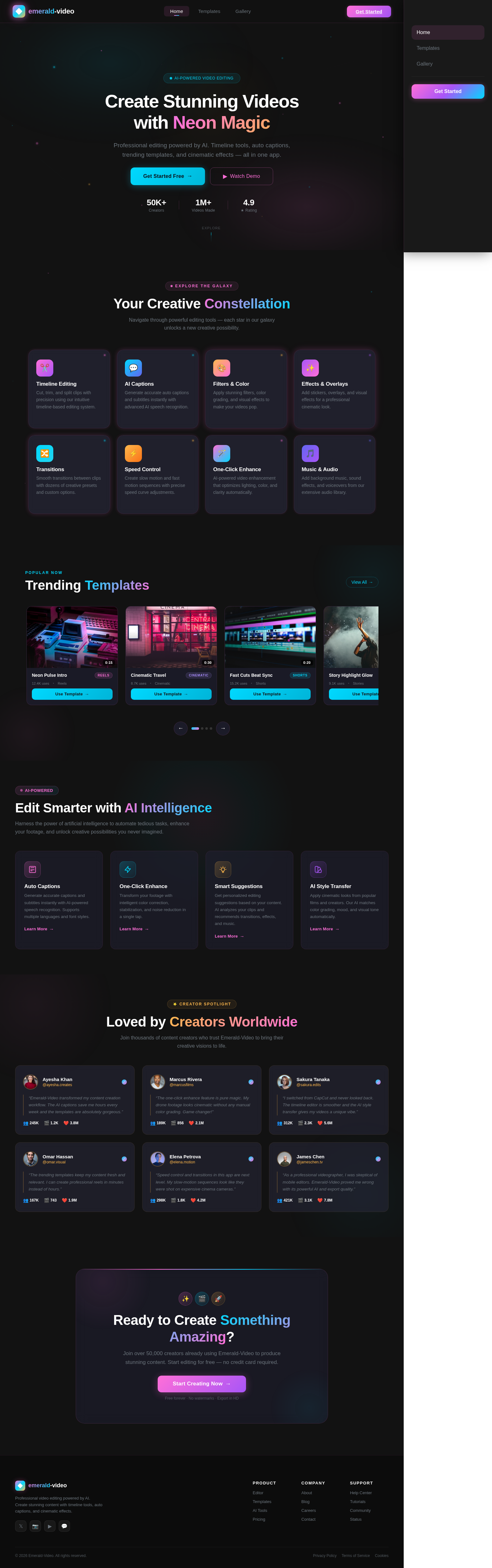
Create Stunning Videos
with Neon Magic
Professional editing powered by AI. Timeline tools, auto captions, trending templates, and cinematic effects — all in one app.
Your Creative Constellation
Navigate through powerful editing tools — each star in our galaxy unlocks a new creative possibility.
Timeline Editing
Cut, trim, and split clips with precision using our intuitive timeline-based editing system.
Try it now →AI Captions
Generate accurate auto captions and subtitles instantly with advanced AI speech recognition.
Try it now →Filters & Color
Apply stunning filters, color grading, and visual effects to make your videos pop.
Try it now →Effects & Overlays
Add stickers, overlays, and visual effects for a professional cinematic look.
Try it now →Transitions
Smooth transitions between clips with dozens of creative presets and custom options.
Try it now →Speed Control
Create slow motion and fast motion sequences with precise speed curve adjustments.
Try it now →One-Click Enhance
AI-powered video enhancement that optimizes lighting, color, and clarity automatically.
Try it now →Music & Audio
Add background music, sound effects, and voiceovers from our extensive audio library.
Try it now →Popular Now
Trending Templates
 0:15
0:15Neon Pulse Intro
Reels 0:30
0:30Cinematic Travel
Cinematic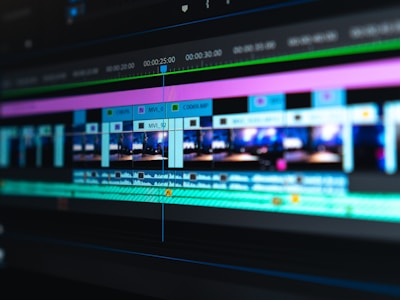 0:20
0:20Fast Cuts Beat Sync
Shorts 0:10
0:10Story Highlight Glow
 0:25
0:25Product Showcase Pro
Reels 0:18
0:18Vlog Transitions Pack
Shorts 0:12
0:12Mood Board Aesthetic
 0:35
0:35Epic Drone Reveal
CinematicEdit Smarter with AI Intelligence
Harness the power of artificial intelligence to automate tedious tasks, enhance your footage, and unlock creative possibilities you never imagined.
Auto Captions
Generate accurate captions and subtitles instantly with AI-powered speech recognition. Supports multiple languages and font styles.
One-Click Enhance
Transform your footage with intelligent color correction, stabilization, and noise reduction in a single tap.
Smart Suggestions
Get personalized editing suggestions based on your content. AI analyzes your clips and recommends transitions, effects, and music.
AI Style Transfer
Apply cinematic looks from popular films and creators. Our AI matches color grading, mood, and visual tone automatically.
Loved by Creators Worldwide
Join thousands of content creators who trust Emerald-Video to bring their creative visions to life.

Ayesha Khan
@ayesha.creates
“Emerald-Video transformed my content creation workflow. The AI captions save me hours every week and the templates are absolutely gorgeous.”

Marcus Rivera
@marcusfilms
“The one-click enhance feature is pure magic. My drone footage looks cinematic without any manual color grading. Game changer!”

Sakura Tanaka
@sakura.edits
“I switched from CapCut and never looked back. The timeline editor is smoother and the AI style transfer gives my videos a unique vibe.”

Omar Hassan
@omar.visual
“The trending templates keep my content fresh and relevant. I can create professional reels in minutes instead of hours.”

Elena Petrova
@elena.motion
“Speed control and transitions in this app are next level. My slow-motion sequences look like they were shot on expensive cinema cameras.”

James Chen
@jameschen.tv
“As a professional videographer, I was skeptical of mobile editors. Emerald-Video proved me wrong with its powerful AI and export quality.”
Ready to Create Something Amazing?
Join over 50,000 creators already using Emerald-Video to produce stunning content. Start editing for free — no credit card required.
Free forever · No watermarks · Export in HD
No comments yet. Be the first!